Branding Moodboards
At the start of a company, it all starts a brand. Once Kevin and I were given the name, it was up to us to determine the feel and look of the brand identity. After many iterations, we determined that the brand would have a a simple and futuristic feel to its design. Something elegant with minimalistic qualities. The some of the other versions of the moodboards and logo can be seen below.
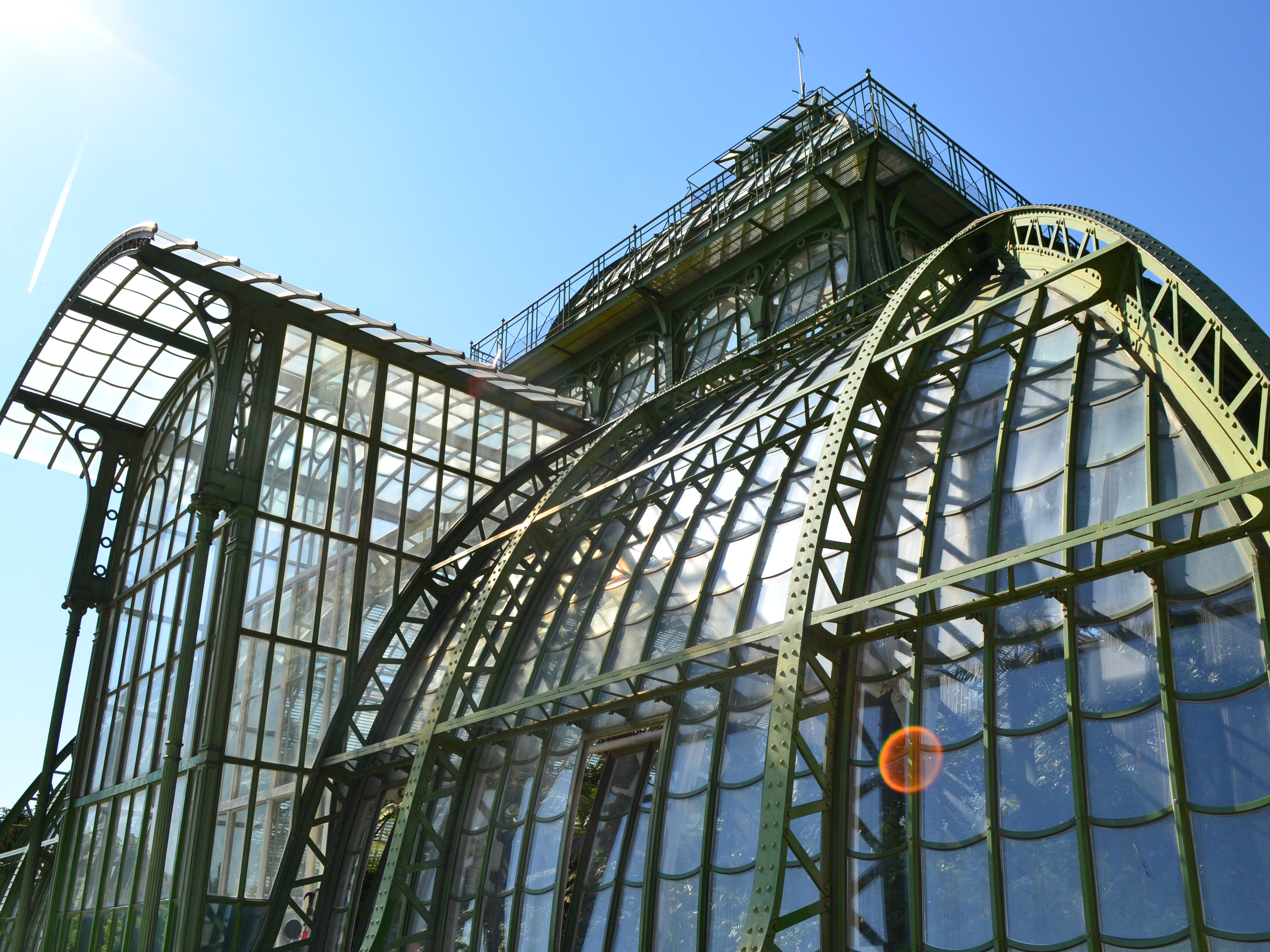
An early iteration of moodboard

An early iteration of moodboard
Brand Guidelines
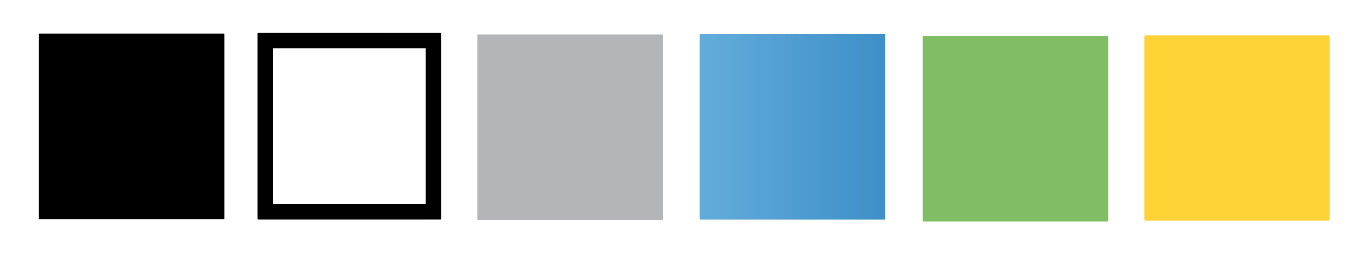
Once we determined the proper feel and logo of the brand, it was on to the identity. We determined the fonts they used, a color palette (as seen below), and decided on an angular approach to the design with pops of color. The primary colors of use would be black and white to keep the minimalistic and clean aesthetic while the blue, gray, green, and yellow would be used as optional pops of color.
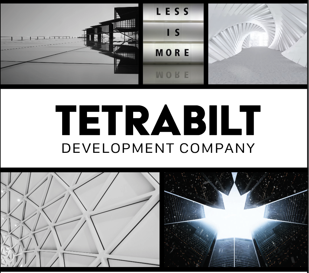
Marketing One-Pager
Once the branding was figured out, it was clear that marketing is necessary for any business, especially one that is just starting out. As such, a one-pager was developed with its own unique set of icons to be used for the organization.


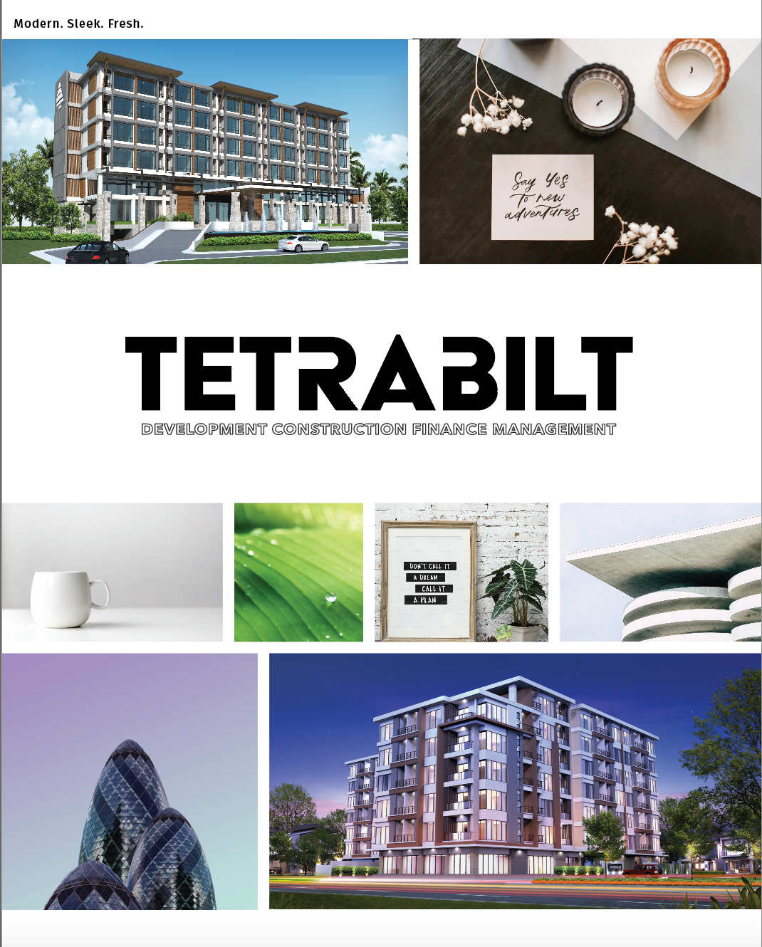
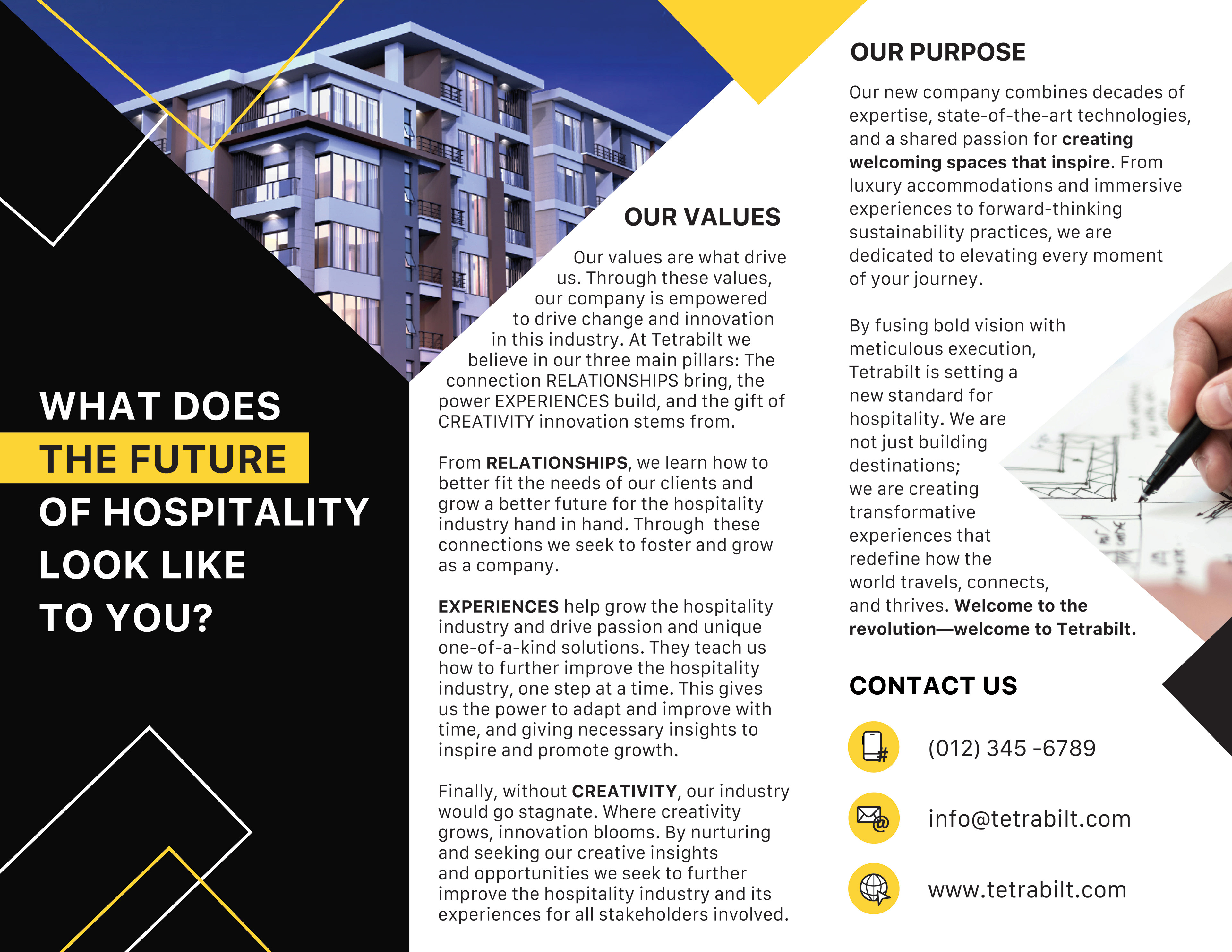
Trifold Front
Trifold Back
Marketing Trifold
A trifold was also developed for company use as seen above.
Website
A website for any new company is a must. Interested in about learning more from Tetrabilt Development Company? Click the button to visit their site!