App Research:
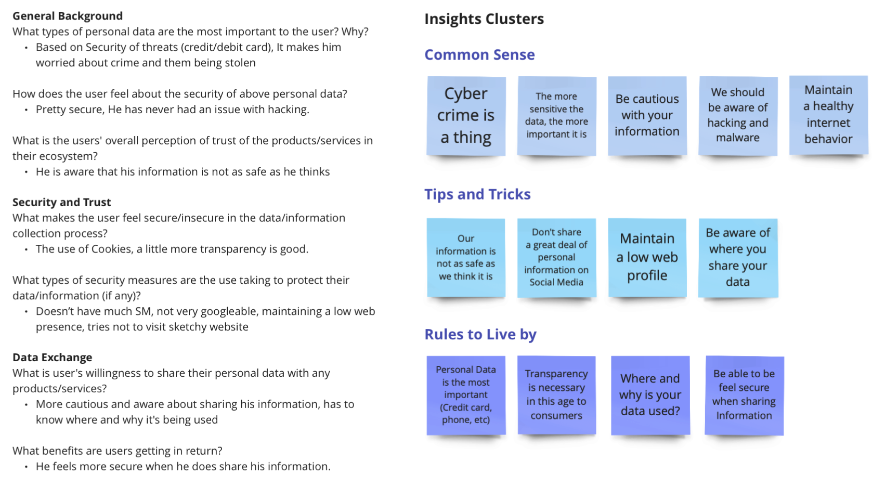
Like all design, it all starts with research. I started studying various apps and how they collected and monitored data. Based on these insights I compiled a list of insights and an interview below.
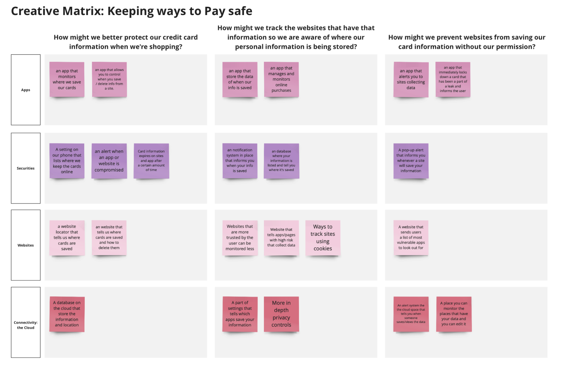
Creative Matrix:
From there I created a Creative Matrix to ideate and organize the various ideas I had in regards to the app I wished to create. After this I ideated on various storyboards and benchmarked a few key apps.
App Overview:
ShopGuard is a virtual wallet app that allows the user to make purchases, monitor their purchases and information including what information is saved where, be alerted to possible breaches, and to learn about the latest news in cyber-security all wrapped into one app.
Target Audience:
My target audience for this app is young adult shoppers who would like to have better control of their data online especially when purchasing on the internet.
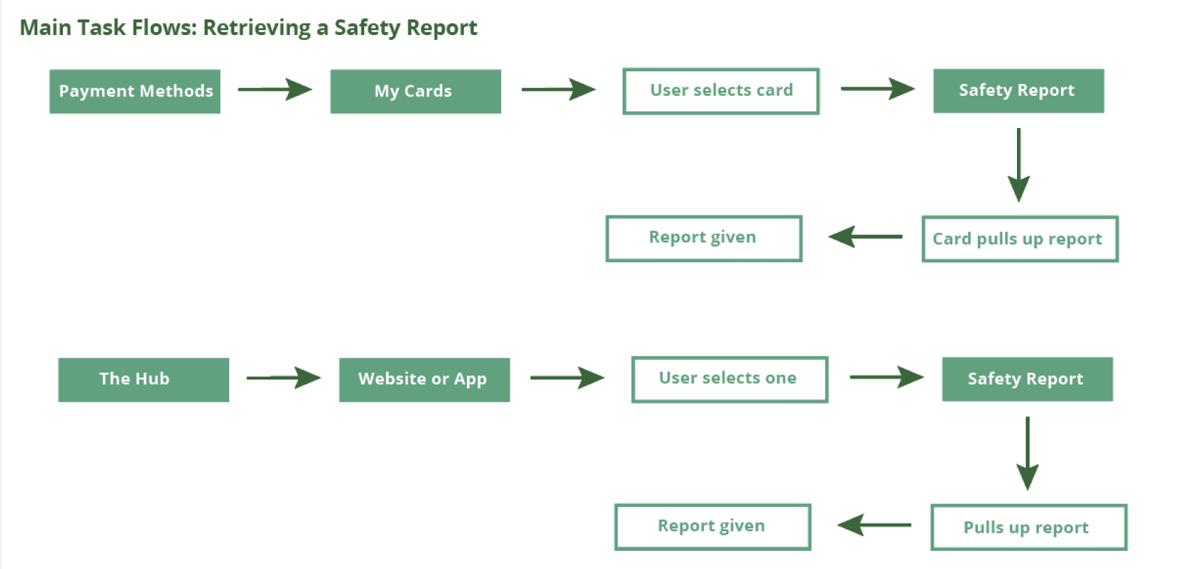
Taskflows:
Next, I created my three main taskflows for ShopGuard to design around which can be seen below. I focused on three features that allowed the user to access them in multiple ways based on where they were in the app.
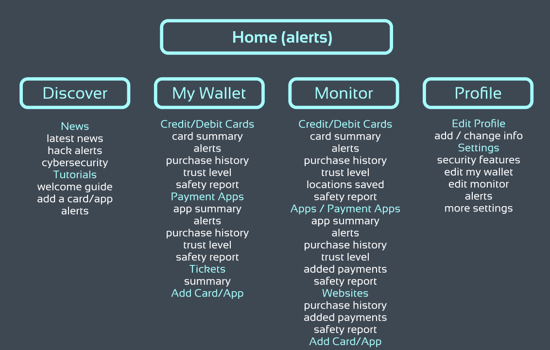
Information Architecture:
The app was then organized by the various features and how I wanted the app to flow.
Moodboard:
The moodboard I designed was tailored to embody bright colors contrasted with a darker background.I wanted a sleek design that was bold and vivid, but also be easy to use and visually oriented.
Wireframes One:
These are my first selection of wireframes I compiled. Each taskflow section highlights the areas I found that may have an issue and the text below these flows contain what I adjusted and changed to fix them.
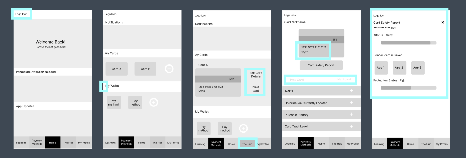
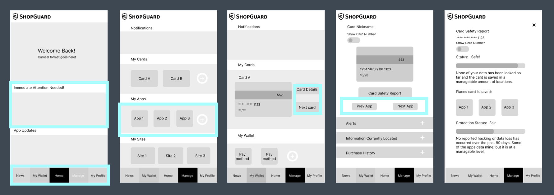
Taskflow 1: Find a Safety Report A
This is the original flow of my ‘Look at a safety report’ process. This flow contains the process of how to look up a safety report in the ‘Payment Method’ section of the app. By selecting the card you desire to recieve a report from you are able to retrieve a report on the safety of that card online. This was a good starting format as to finding out how I wanted to better arrange my elements and design features of the app. In blue are the changes I decided to make for my next set of wireframes two.
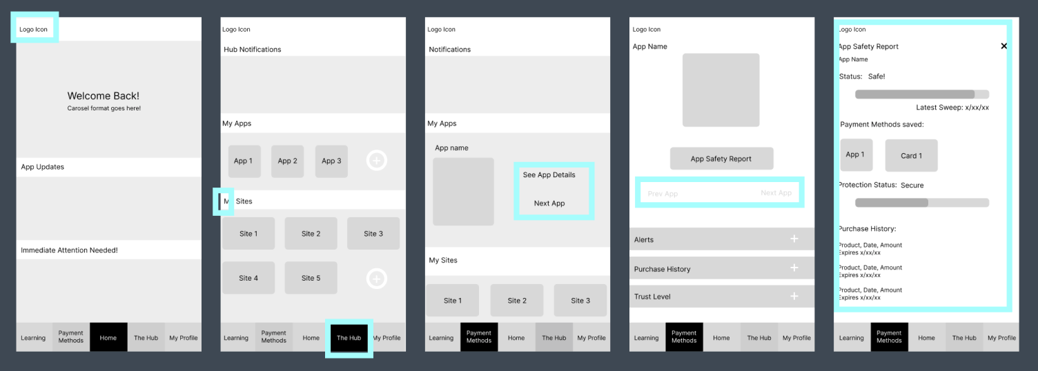
Taskflow 1: Find a Safety Report B
This is the original flow of my ‘Look at a safety report’ process. This flow contains the process of how to look up a safety report in the ‘Hub’ section of the app. By selecting the app you desire to receive a report from you are able to retrieve a report on the safety of that app. From here I was primarily focused on looking at the layout and content of the app then prioritizing spacing. This allowed me to really discover the core of my app, but resulted in the layouts being far too close to the edge of the screen. In blue are the changes I decided to make for my next set of wireframes two.

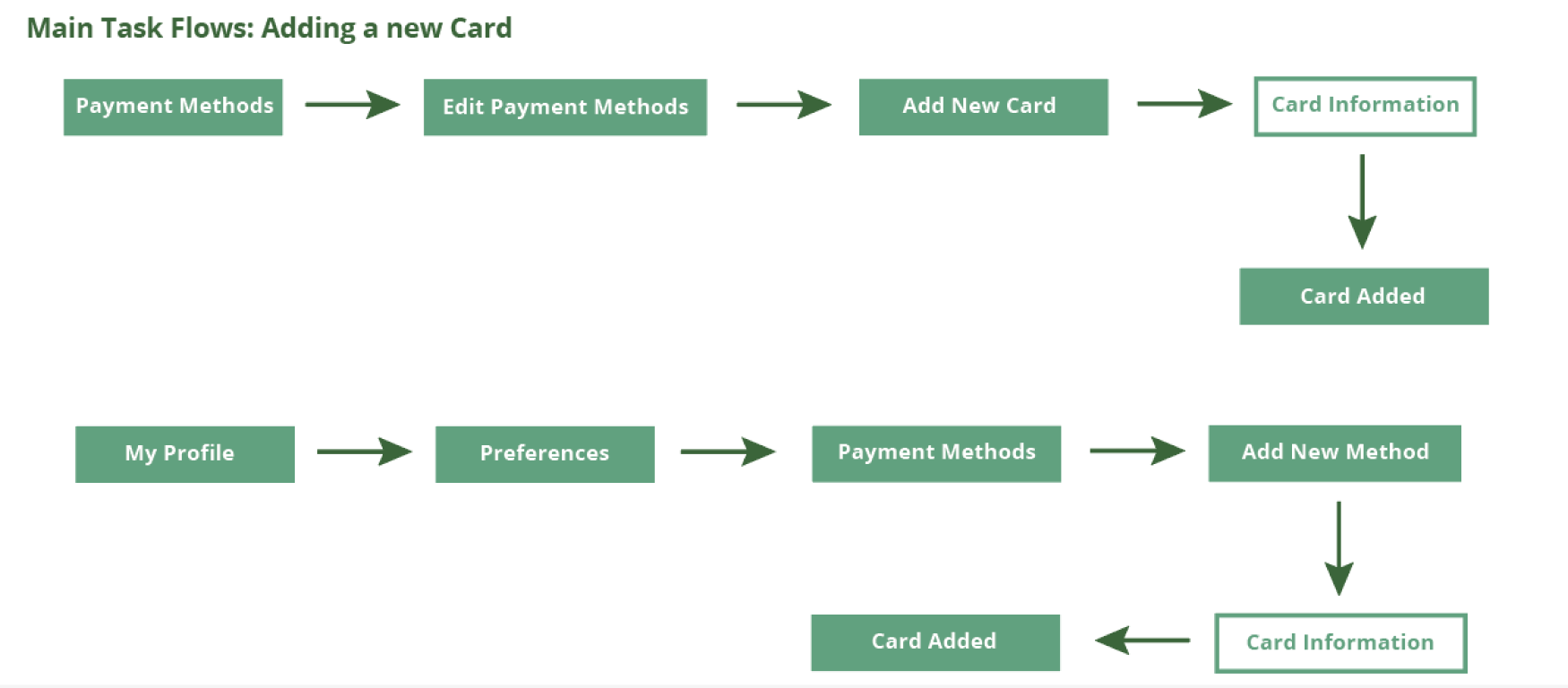
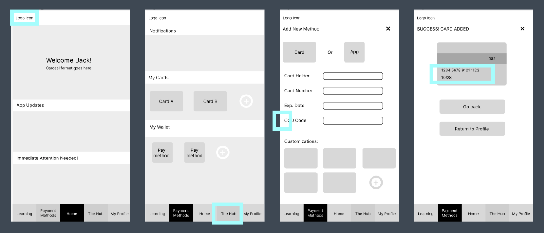
Taskflow 2: Add a Card A
This is the original flow of my ‘Look at a safety report’ process. This flow contains the process of how to look up a safety report in the ‘Payment Methods’ section of the app. By selecting the app you desire to recieve a report from you are able to retrieve a report on the safety of that app. In this model I addded a customization feature to be added to allow for a more personal touch. In blue are the changes I decided to make for my next set of wireframes two.
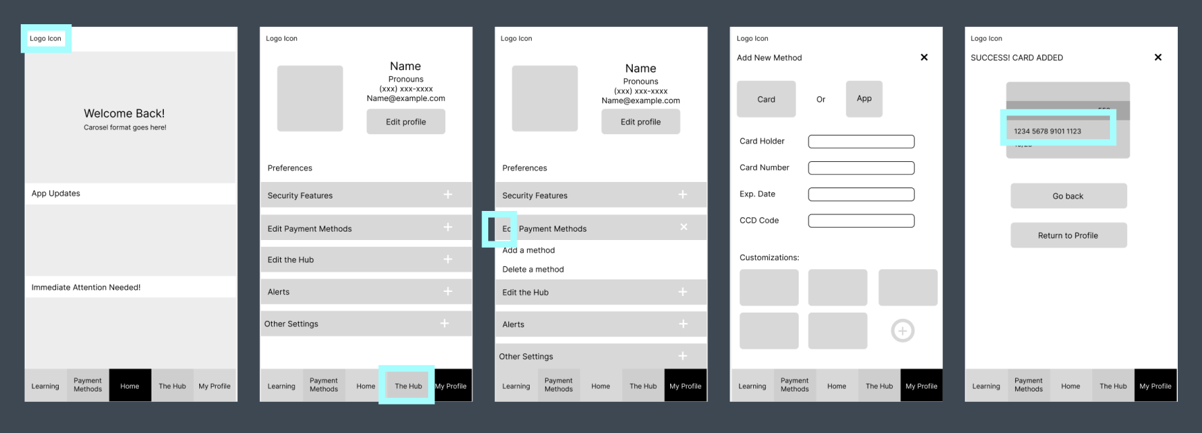
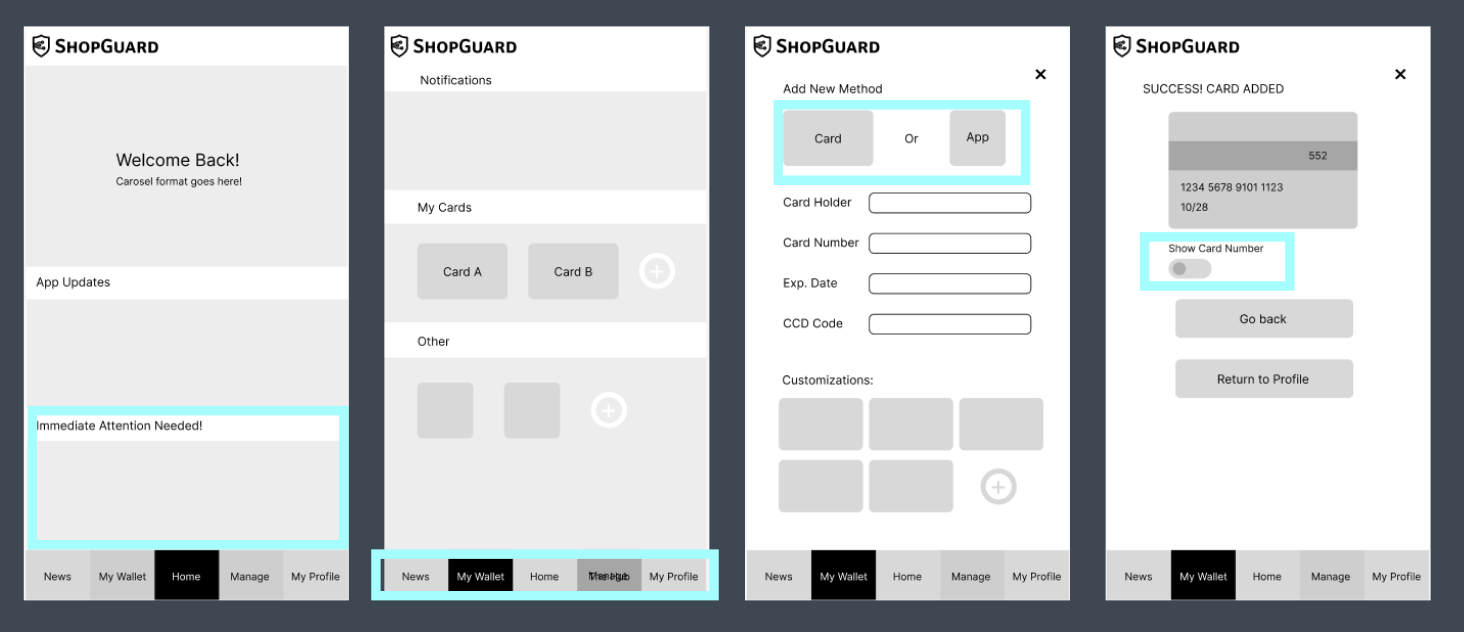
Taskflow 2: Add a Card B
This is the original flow of my ‘Add a Card’ process. This flow contains the process of how to add a card in the ‘My Profile’ section of the app. By clicking the addition button the user is prompted to fill in their information and allows them to add a card to their Payment Methods. As a designer, I like to have mutiple ways to do things in an app to help the user in any way. This will be an ongoing trend through-out these spreads. In blue are the changes I decided to make for my next set of wireframes two.

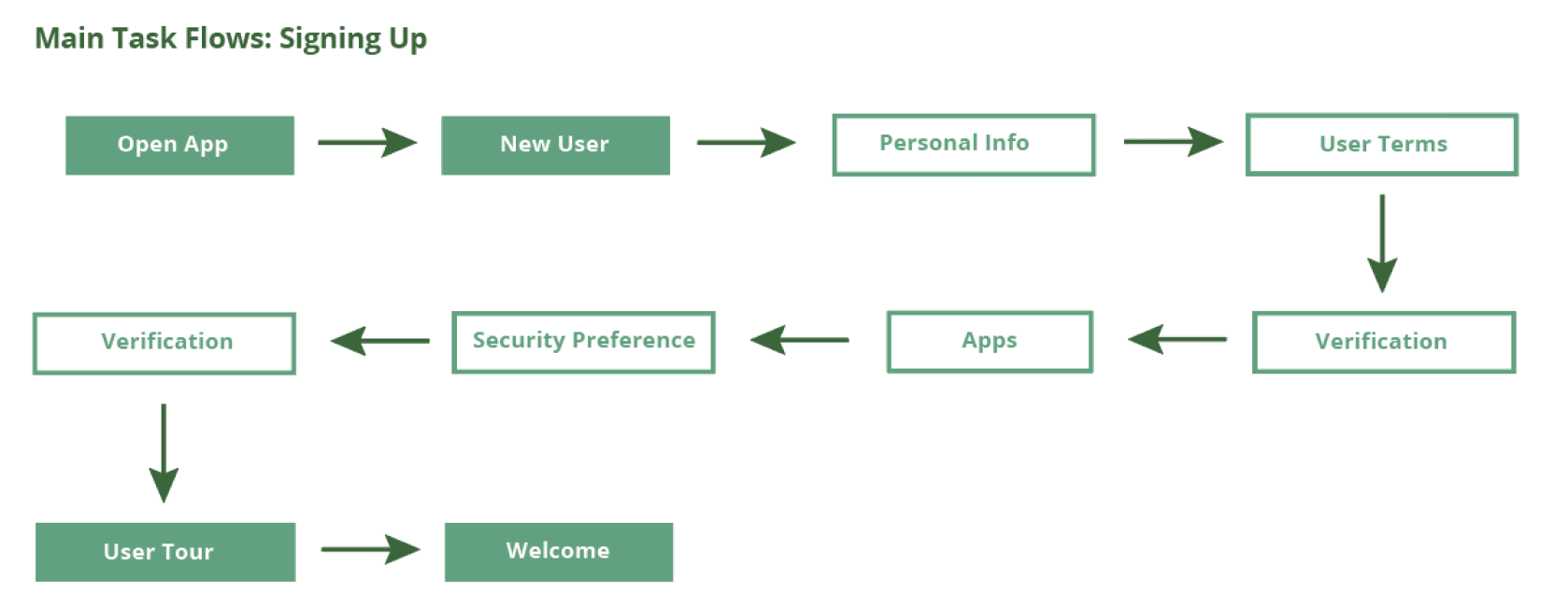
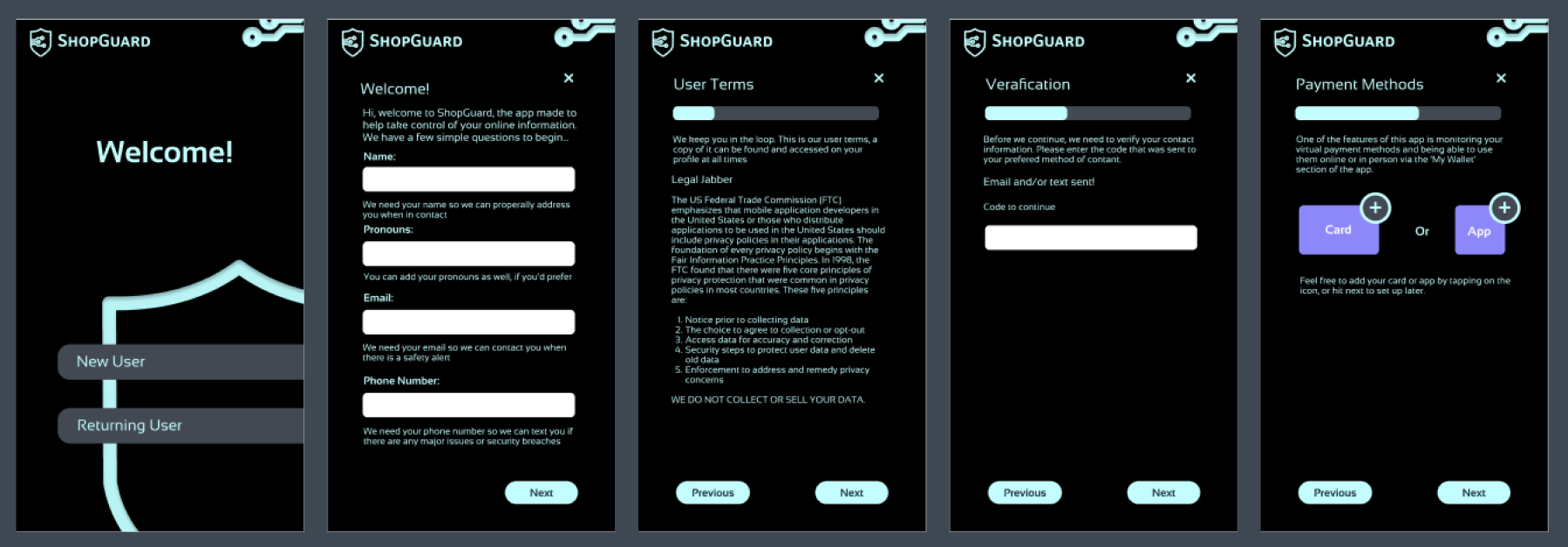
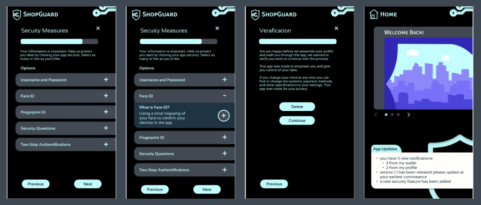
Taskflow 3: Sign Up
This is the original flow of my ‘New User Sign-Up’ process. This flow contains the process of how to sign up for the app. In blue are the changes I decided to make for my next set of wireframes.
Wireframes Two:
These are the next selection of wireframes I compiled. Each taskflow section highlights the areas I found that may have an issue and the text below these flows contain what I adjusted/changed to fix them.
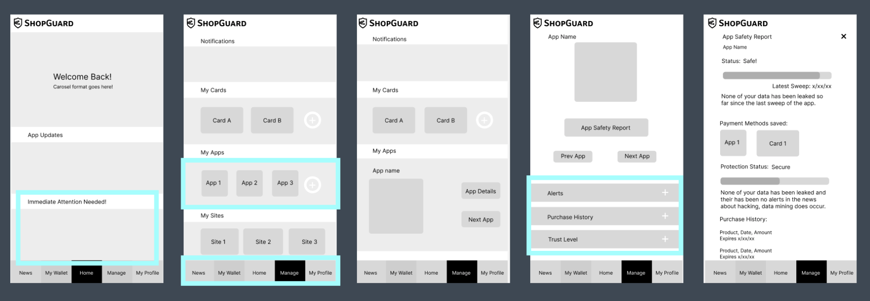
Taskflow 1: Find a Safety Report A
Addition of logo, spacing adjusted, the hub was changed to allow the user universal monitoring ability and payment methods became a wallet hub, Button format added, ability to hide/show credit card number, Card Safety report content built on and expanded. In blue are the changes I decided to make for the finals.
Taskflow 1: Find a Safety Report B
Addition of logo, spacing adjusted, the hub was changed to allow the user universal monitoring ability and payment methods became a wallet hub, Button format added, App Safety report content built on and expanded. In blue are the changes I decided to make for the finals.
Taskflow 2: Add a Card A
Addition of logo, spacing adjusted, the hub was changed to allow the user universal monitoring ability and payment methods became a wallet hub, additional ‘Add a Card’ Flow added to Monitor. In blue are the changes I decided to make for the finals.
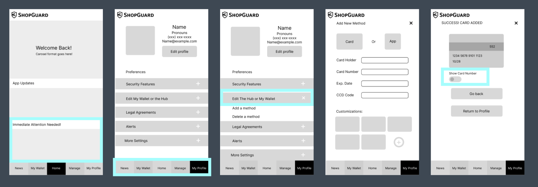
Taskflow 2: Add a Card B
Addition of logo, spacing adjusted, the hub was changed to allow the user universal monitoring ability and payment methods became a wallet hub, additional ‘Add a Card’ Flow added to Monitor In blue are the changes I decided to make for my next set of wireframes two. In blue are the changes I decided to make for the finals.
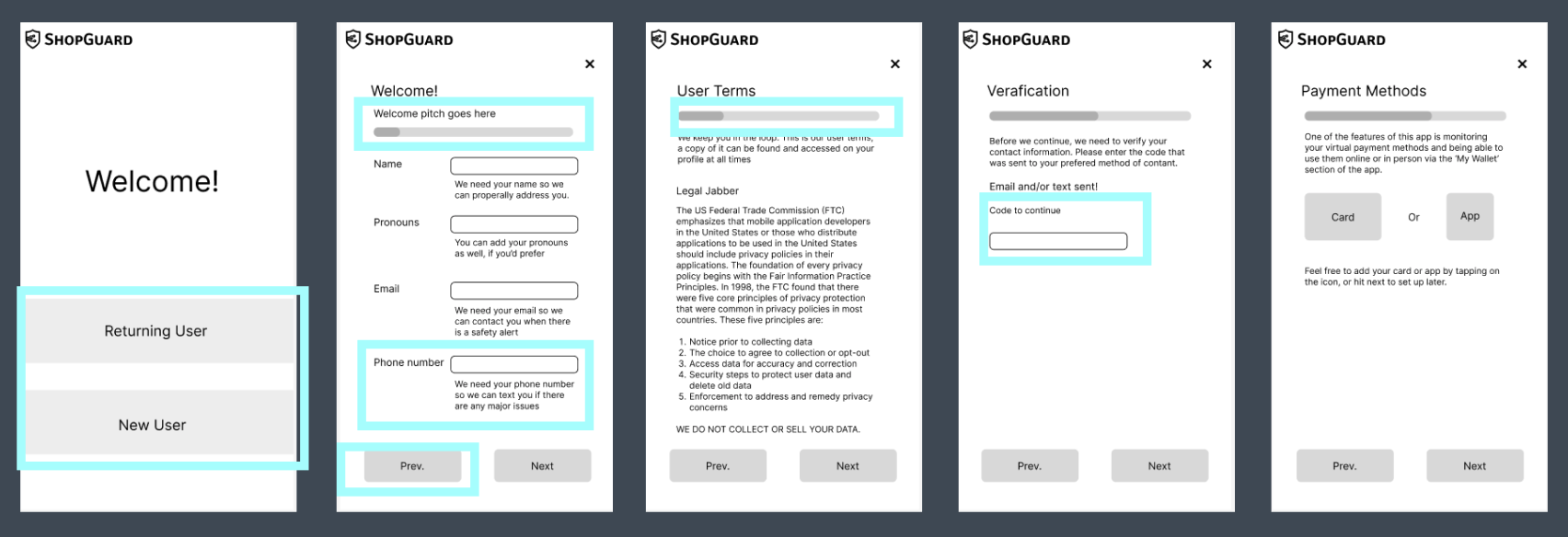
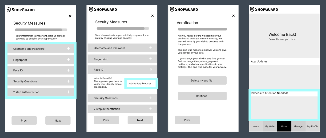
Taskflow 3: Sign Up
Addition of logo, spacing adjusted, added content to verification, added content to security measures, added content to Legal Jabber, added content to user terms, added content to payment methods, added payment methods section to flow, added delete button to verification page.
Final Flows:
This is the end result of my design process.
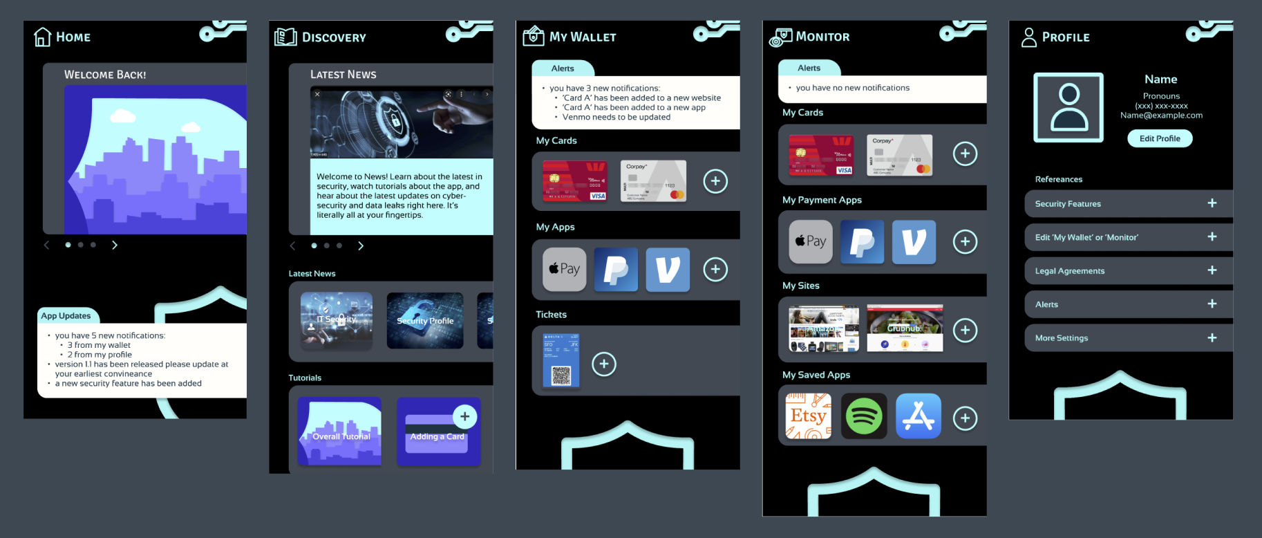
Homescreens No Navigation:
Screens shown in order- Homepage, Discovery Page, My Wallet, Monitor, Profile
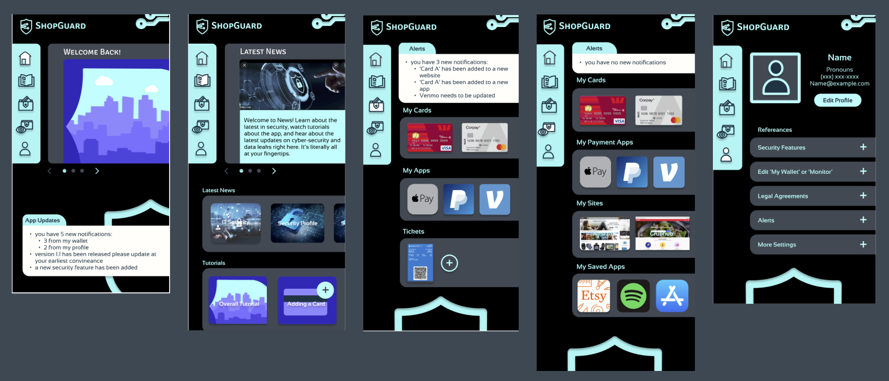
Homescreens with Navigation:
Screens shown in order- Homepage, Discovery Page, My Wallet, Monitor, Profile
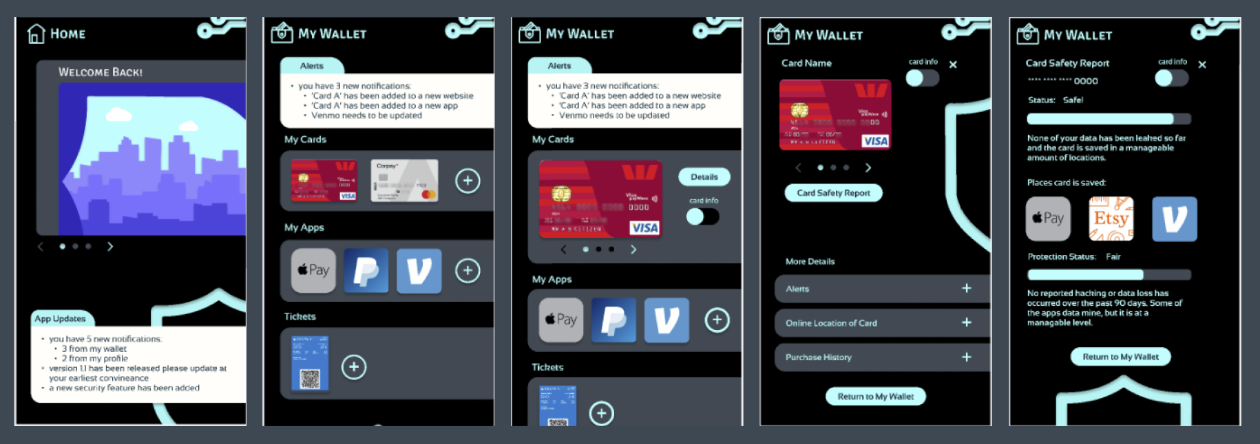
Taskflow 1: Find a Safety Report A
Changes to Finals:
Changed navigation, added color and illustration elements, removed Immediate Attention Needed to only appear if it’s an emergency, changed section format, added components and universal styling.
Flow:
Start at home screen, go to ‘My Wallet’, select card you’d like a safety report on, open ‘Details’ of th card, arrive at card summary, select ‘Card Safety Report’, view safety report.
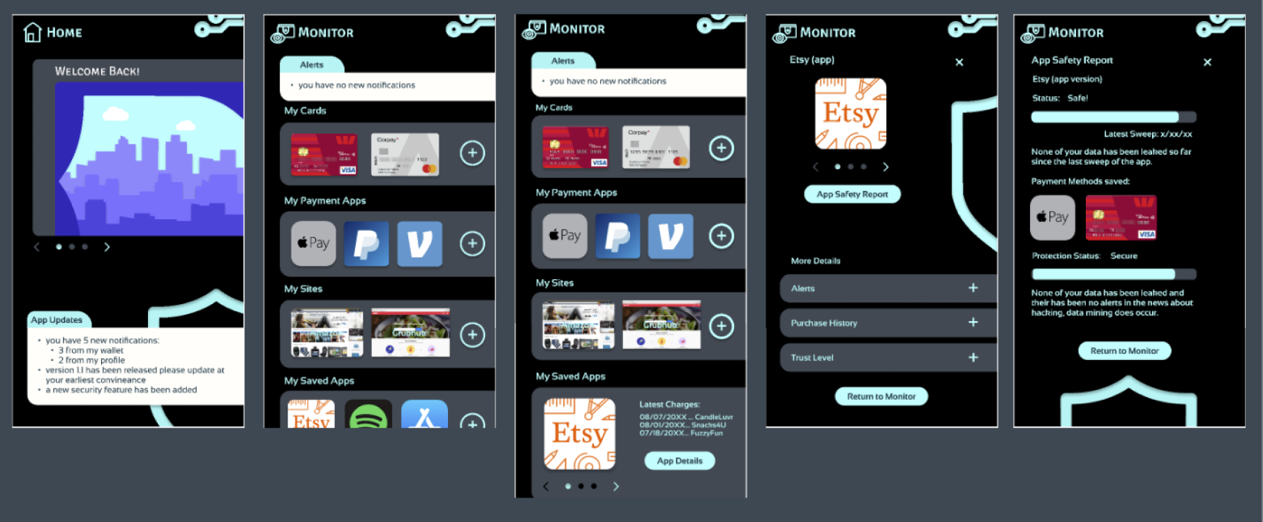
Taskflow 1: Find a Safety Report B
Changes to Finals:
Changed navigation, added color and illustration elements, removed Immediate Attention Needed to only appear if it’s an emergency, changed section format, changed buttons on credit card section to arrows, added components and universal styling.
Flow:
Start at home screen, go to ‘Monitor’, select the app you’d like a safety report on, open ‘App Details’, arrive at App summary, select ‘App Safety Report’, view safety report.
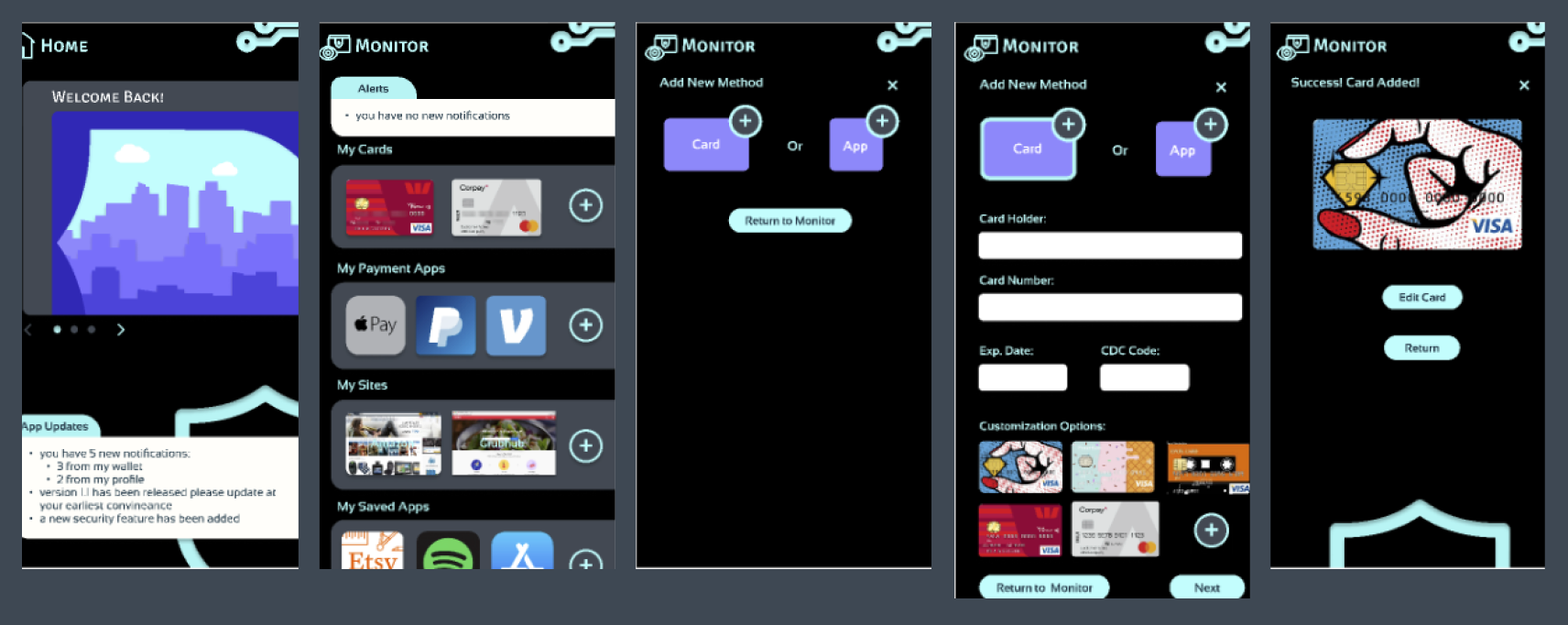
Taskflow 2: Add a Card A
Changes to Finals:
Changed navigation, added color and illustration elements, removed Immediate Attention Needed to only appear if it’s an emergency, changed section format, added components and universal styling, removed Show card number on verification screen, added ‘Ticket’ section to ‘My Wallet’, added a selection for app or card section, added back and next buttons to ‘Add new Method’.
Flow:
Start at home screen, go to ‘Monitor’, select one of the ‘Add’ icons (circle with plus sign in the center), select card, fill out card information, review card summary, exit flow.
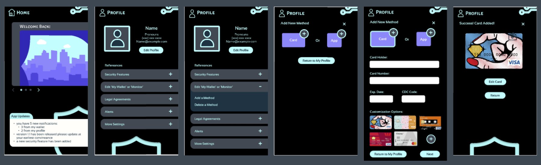
Taskflow 2: Add a Card B
Changes to Finals:
Changed navigation, added color and illustration elements, removed Immediate Attention Needed to only appear if it’s an emergency, changed section format, added components and universal styling, removed Show card number on verification screen, separated ‘My Apps’ into two sections in ‘Monitor’, added a selection for app or card section, added back and next buttons to ‘Add new Method’.
Flow:
Start at home screen, go to ‘My Profile, select ‘Edit My Wallet or Monitor’, select ‘Add a Method’, select card, fill out card information, review card summary, exit flow.
Taskflow 3: Sign Up
Changes to Finals:
Changed navigation, added color and illustration elements, added components and universal styling, adjusted text box size, adjusted drop-down format, removed Immediate Attention Needed to only appear if it’s an emergency, added addition button to Security Features flow, adjusted Welcome formatting, added Welcome content, adjusted size and scale of progress bar, removed previous button on Welcome screen, adjusted Sign-In/Log-In page format.
Flow:
Start at log-in screen, select ‘New User’, fill in relevant information, hit the ‘Next’ button, accept user terms, hit the ‘Next’ button, send and enter verification code, hit the ‘Next’ button, start the payment methods process and/or hit the ‘Next’ button, Select any security features you’d like to add, hit the ‘Add’ button, once you’ve selected all the ones you’d like hit the ‘Next’ button, verify you’d like to continue the process by hitting ‘Continue’, start on Welcome Home Page and start the user tutorial.
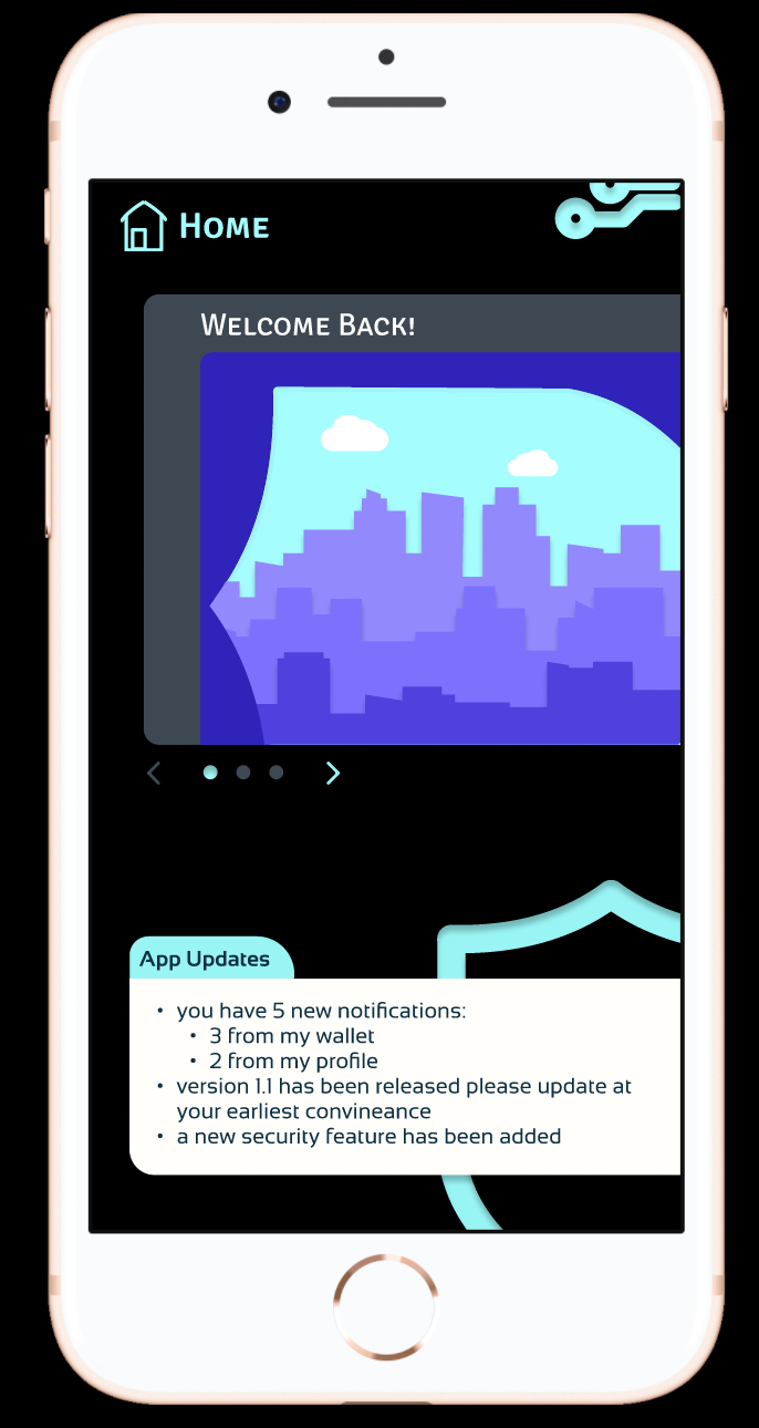
Final Mock-Up:
This is the final mock-up of my design on an iPhone.
This is the final mock-up of my design on an iPhone.