Trend Analysis
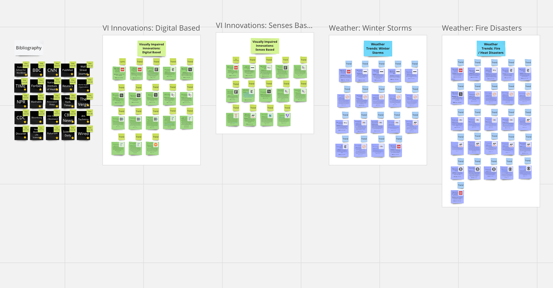
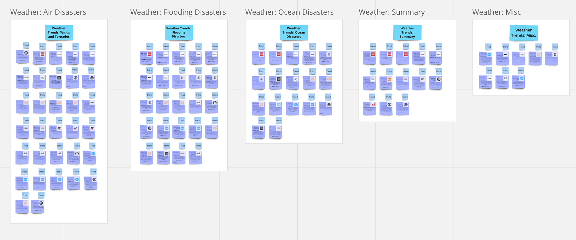
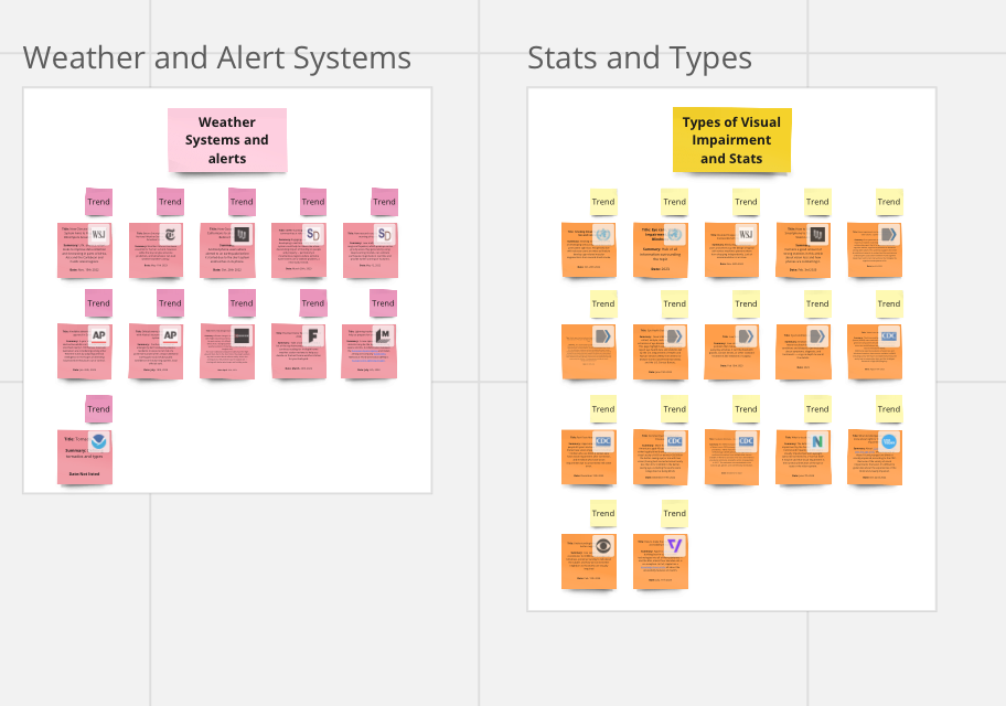
In this Thesis, my exploratory research included an in depth trend analysis around the topics of innovations of visual impairment, current weather alerts and system alerts, types of visual impairments and statistics, and weather disasters and news. Insights include the following:
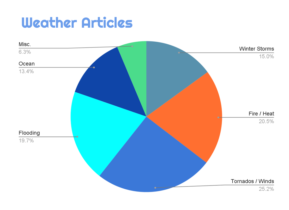
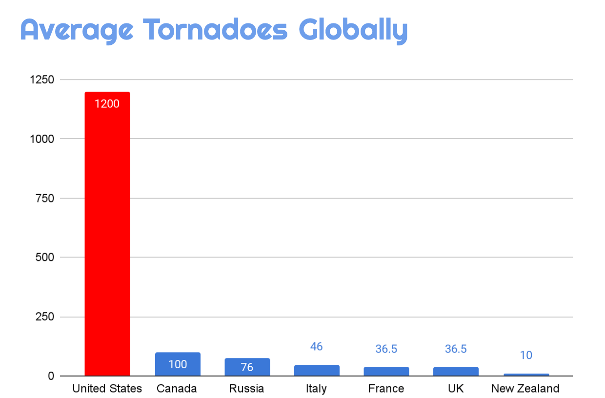
1. Weather Emergencies are becoming fairly common. Tornados make up my largest category of all articles that are collected between Jan. and Aug.
2. Many people with Visual Impairments seem to be receiving accommodations in technological ways such as QR codes, website accommodations, and digital platforms.
Wireless Emergency Alerts
Originally created as apart of the Warn, Alert, and Response Network (WARN) act in established in 2008. Wireless Emergency Alerts (WEA) was operational in 2012 to warn the public of emergencies. Since its founding it has been used over 84,000 times to send various alerts.
All commercial wireless services are required to use these wireless push notifications by law.
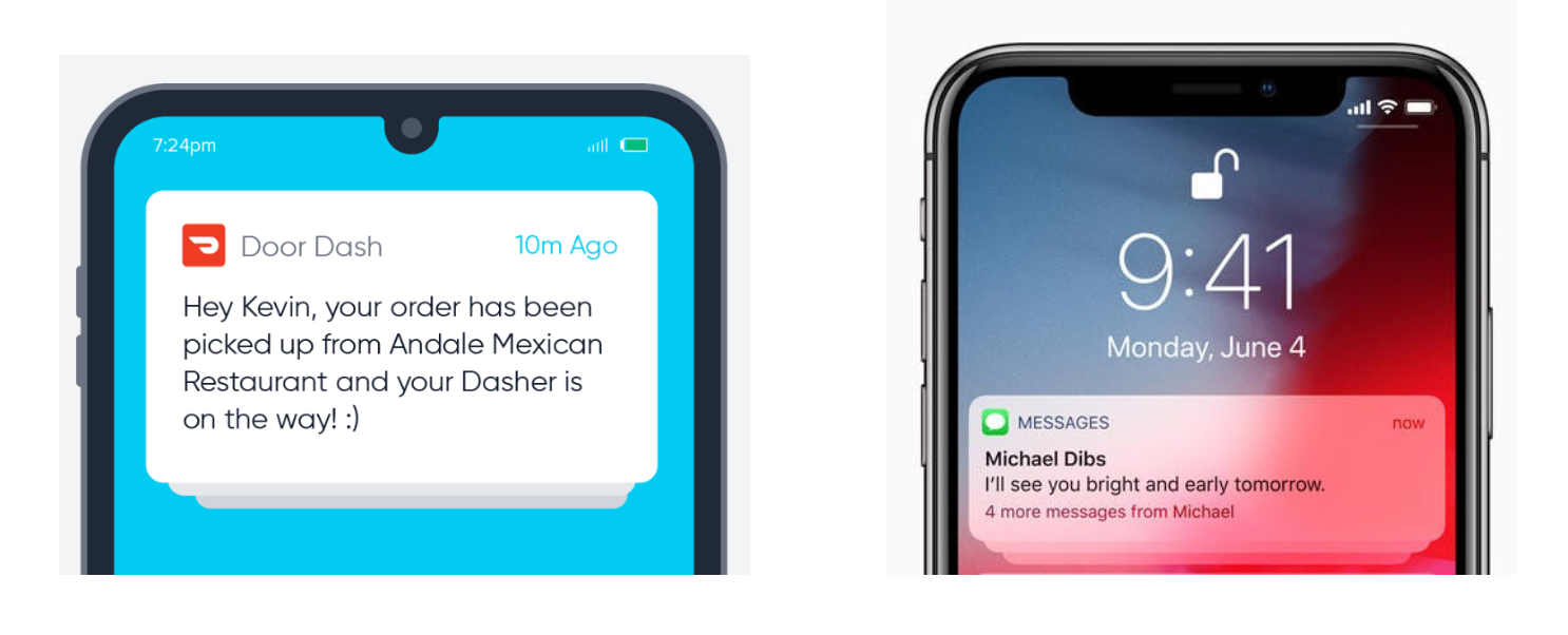
Currently there are accommodations for the deaf in place, but not for those with visual impairment. There is no system in place for people with Vision Impairments.
Visual Impairment and User Journey
A Visual Impairment is when an eye condition affects the vision and visual features of an individual. Globally, 2.2 Billion people have some form of Visual Impairment (World Health Organization).
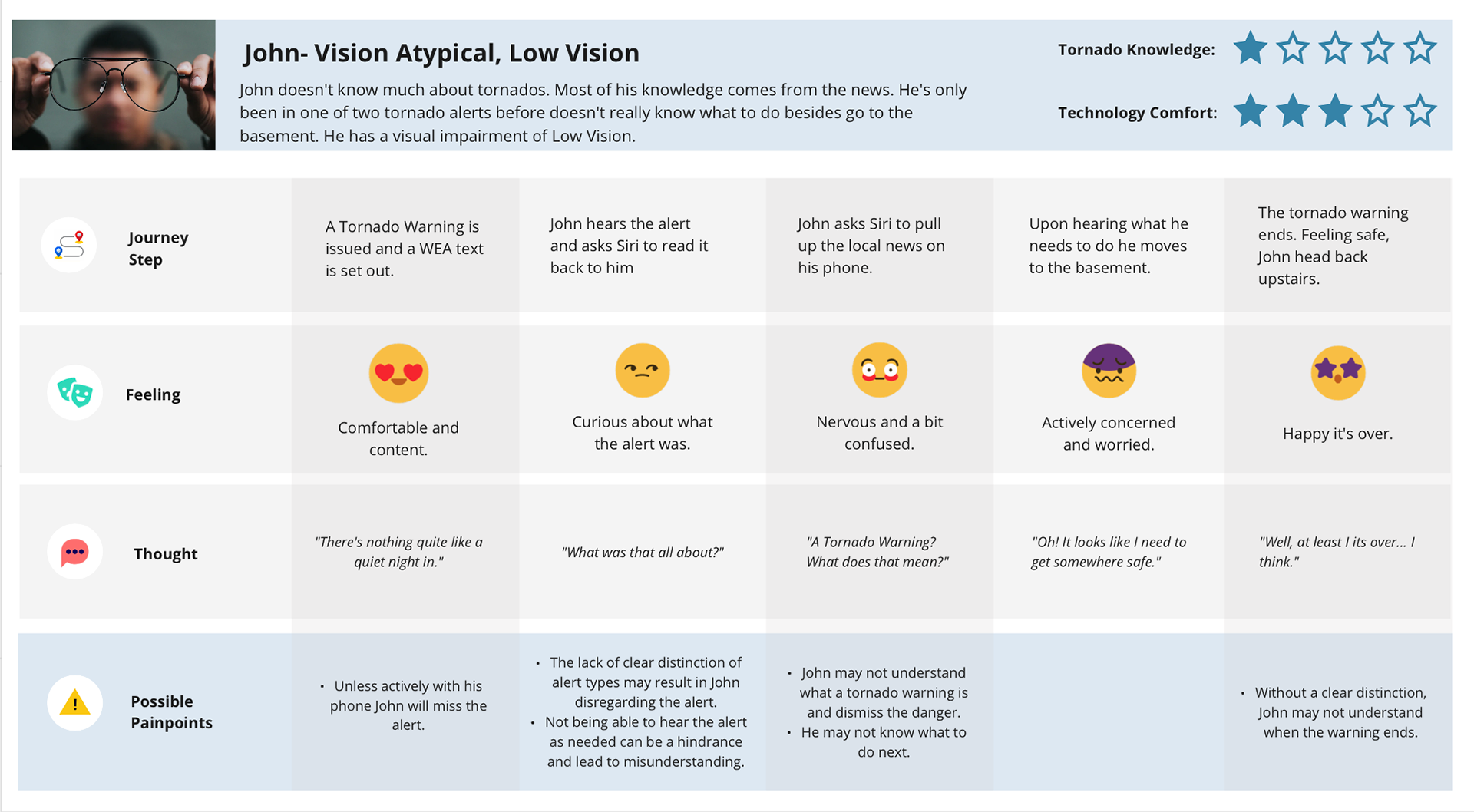
From information gathered from an interview and research this user journey was created to show an experience of a visual impaired user experiencing a tornado alert. The following insights were collected:
1. Alerts are easy to miss if not present.
2. There is a lack of ability to easily understand what type of alert is being given.
3. Knowledge about Tornados is subjective and dependent on the person receiving them.
4. There is no clear indication when the alert has concluded.
Current Standards
The notification itself has a uniform design based on the brand of the smartphone used, though the content itself is subject to change.
Color: The current color of notifications are largely dependent on what brand of Smartphone users choose. Android phones favor a white box with black text that contains the desired notification unless the phone's user changes the color manually. Apple devices prefer either a semi-transparent light-gray rounded box or a semi-transparent dark-gray rounded box based on these users' preference for their phone on light or dark mode.
Typography: Both Apple and Android have a push notification standard that includes the logo of the sender if applicable, a title, and a message for the owner of the device. The time the notification was received is also included in their alert. All of Apple’s notifications are in their base font is San Fransico or SF. Android uses their own base font Roboto Flex in their notifications. Both Apple and Android allow the use of italics and bold in their typeface for alerts. The use of emoji’s is also included in this use.
Wayfinding: Both Android and Apple have the ability to involve location in push notification. Currently it is a legal requirement for phones to receive push notification in the event of an emergency in their area.
Image Captions: Sometimes, relevant images or company logos can be found on push notifications in both Apple and Android devices. Images on push notifications can be found to the right of the text by Android, and to the left of the text by Apple (Apple Developer, 2023). Logos relevant to the alert are found at the top left side of the alert on both devices.
Haptics: Haptics is also used to alert users through a buzz to notify them of a push alert. For both Apple and Android a single buzz is used to alert the user of a push notification unless the user sets the phone to notify them otherwise. Haptics is used regardless of what mode a cell phone is in.
Survey
After assembling various visual studies of different ways to present push notifications to the user, a survey was decided to be the best way for the target demographic to interact with the design.
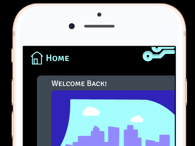
The survey is designed for visually impaired users who take the quiz on their personal smartphone devices. Pictures simulate the phone screen size for receiving alerts and include text for screen-reader use if needed. The questions feature large-scale text and are organized by topic sections.
Survey Results
A total of seven responses were received. Of these individuals, three of the seven responses have Severe Vision Loss with a vision range between 20/200 to 20/400, two individuals had Profound Vision Loss with a range of 20/500 to 20/1000, one individual has Total Loss with a range below 20/1000, and one individual preferred not to disclose their range of sight.
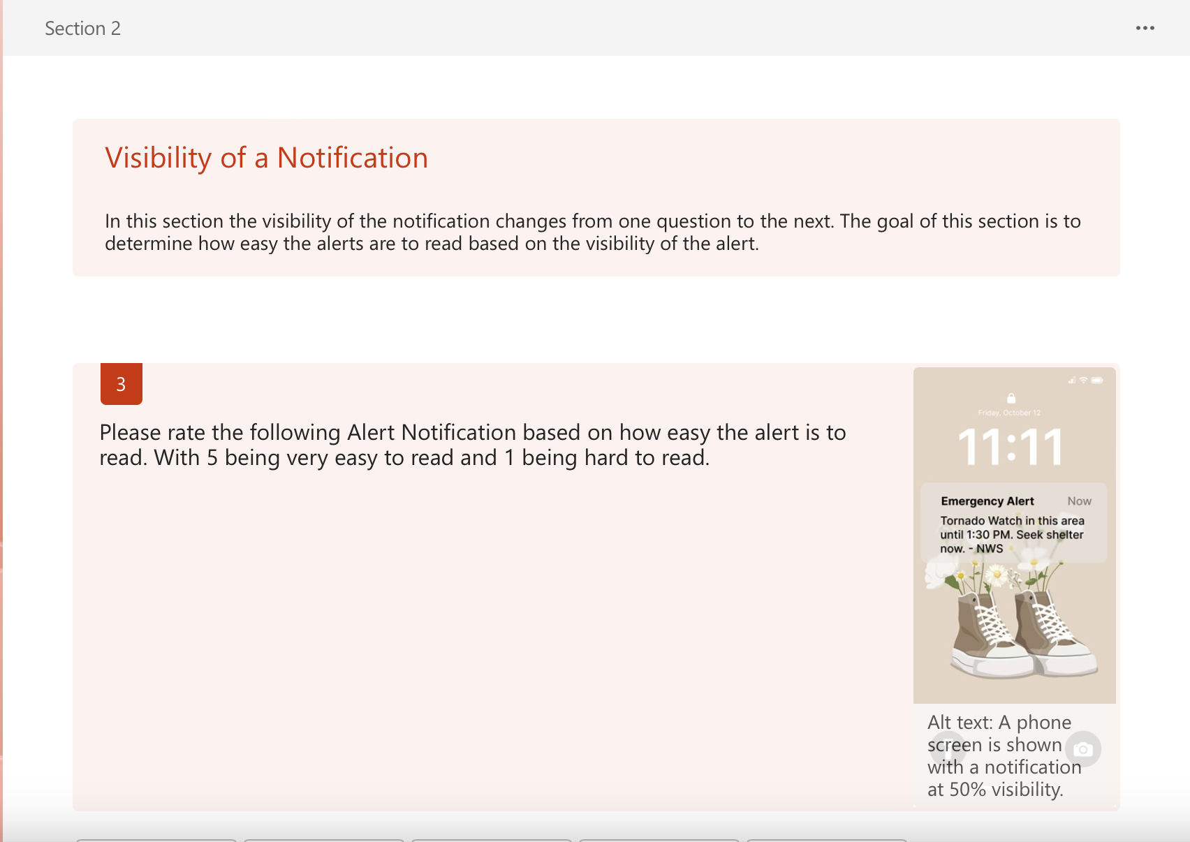
Notification Visibility
It was universally agreed between all seven users that the 100% opacity notification was the easiest for them to see. 90% opacity was the second rated alert, with 50% opacity being placed in third, and 50% opacity being the hardest to see.

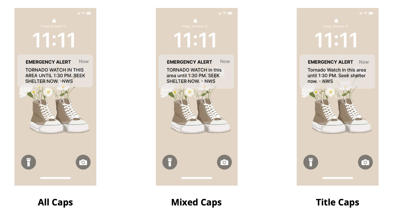
Use of Capitalization
All seven respondents agreed that the last alert using capitalization in the entire message was the easiest for them to read. From there the alert using capitalization to highlight important information was the next easiest, and the alert with only capitalization in the title was the most difficult.
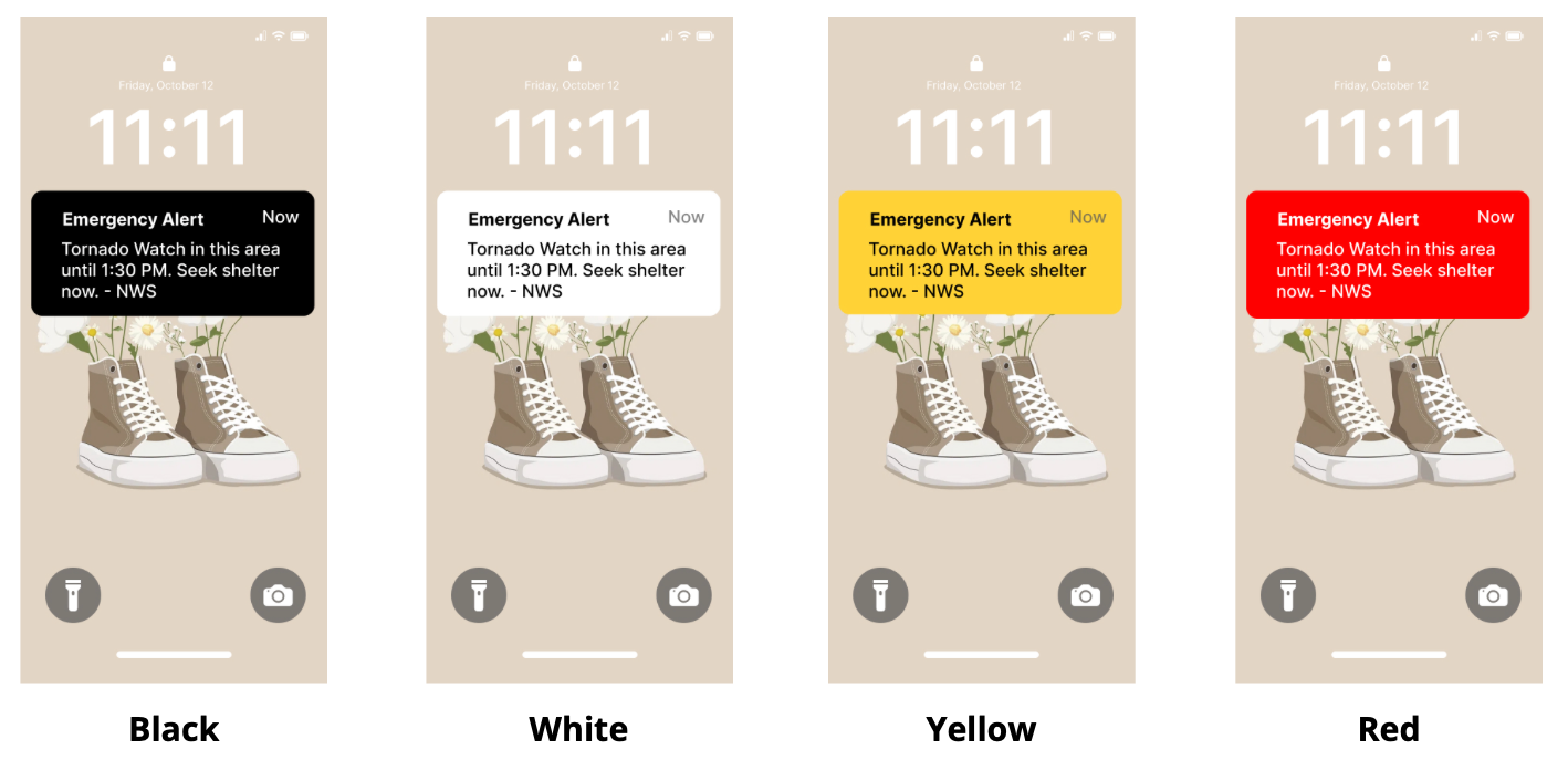
Use of Color
It was universally agreed by the respondents that the black alert with white text was the easiest for them to read. The white alert was perceived as the second easiest, the yellow alert was the third, and the red alert was the most difficult for them to read.
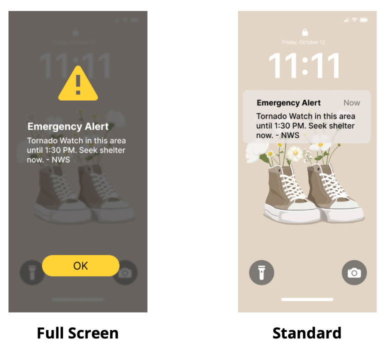
Full Screen vs Current Alerts
The final section of the survey asked about the possibility of full-screen alerts to help gauge interest in this type of alert. Out of seven responses, three claimed they would prefer this type of alert, two remained impartial of it, and two individuals preferred the current smaller screen alerts.
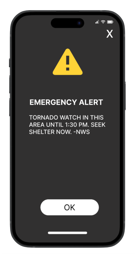
The Ideal Alert
In regards to those with visual impairment, the current system of notifications in place is not an effective system for emergency alerts. Based on the findings of this survey, alerts for people with visual impairments should be high-contrast alerts with a capitalized message in a san-serif typeface. Implementing the use of a full-screen alert should also be carefully considered as well as the current source of this research is directional and needs further results to be collected.
Interested in the Full Version?
To learn more about the entire process of my thesis and the uncut version of the research and process of the thesis, click the link below to view my entire thesis paper.
Final Thesis Poster
Here is a picture of the final Thesis Poster I designed for DAAPworks.