The Product:
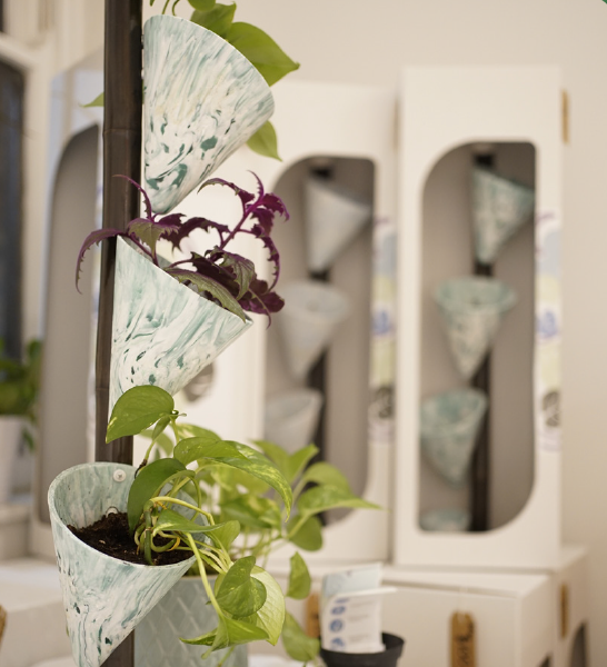
Cascade was designed to be a a functional planter that made watering your plants an experience. It was design with college and apartments in mind, which resulted in its vertical format and we created a sustainable design that embraced everything that we wished to portray.
Research:
It all began with research. First, we determined what type of product we wanted to produce, we launched into exploration and research via interviews and surveys to tailor our end result to our demographic: Plant Parents.
Branding Moodboards:
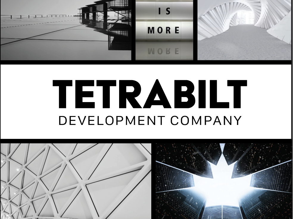
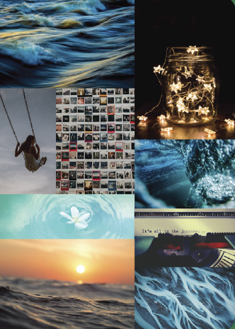
The brand started out with three distinct moodboards which were tested by our audience to really discover the feel of our brand and help us determine the name and tagline of our design. While water was an overarching theme around the topic of a planter determining the type of feeling our logo would embrace was also crucial. A handful of names and taglines were also included in our first survey to help determine the best name for the branding that we would use.


Ideation:
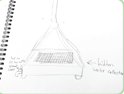
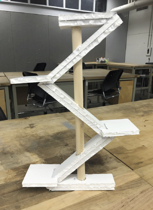
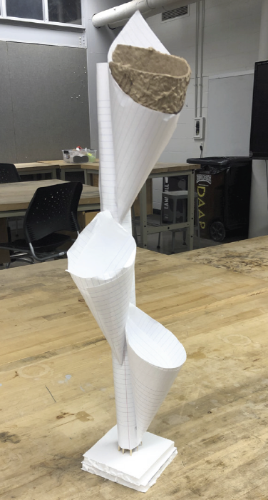
We drew a large variety of possible products to explore and discover. After much debate and exploring pros and cons, we decided our top three designs to explore further. From there, we created three of low fidelity prototypes of the design to help us decide our project.


Branding Round One:
After we received the results, we selected the top three names and taglines. Different styles and logos were explored before once again sending them out to our demographic in a survey to pull insights. I also started some preliminary color studies of some logos.

Form Studies:
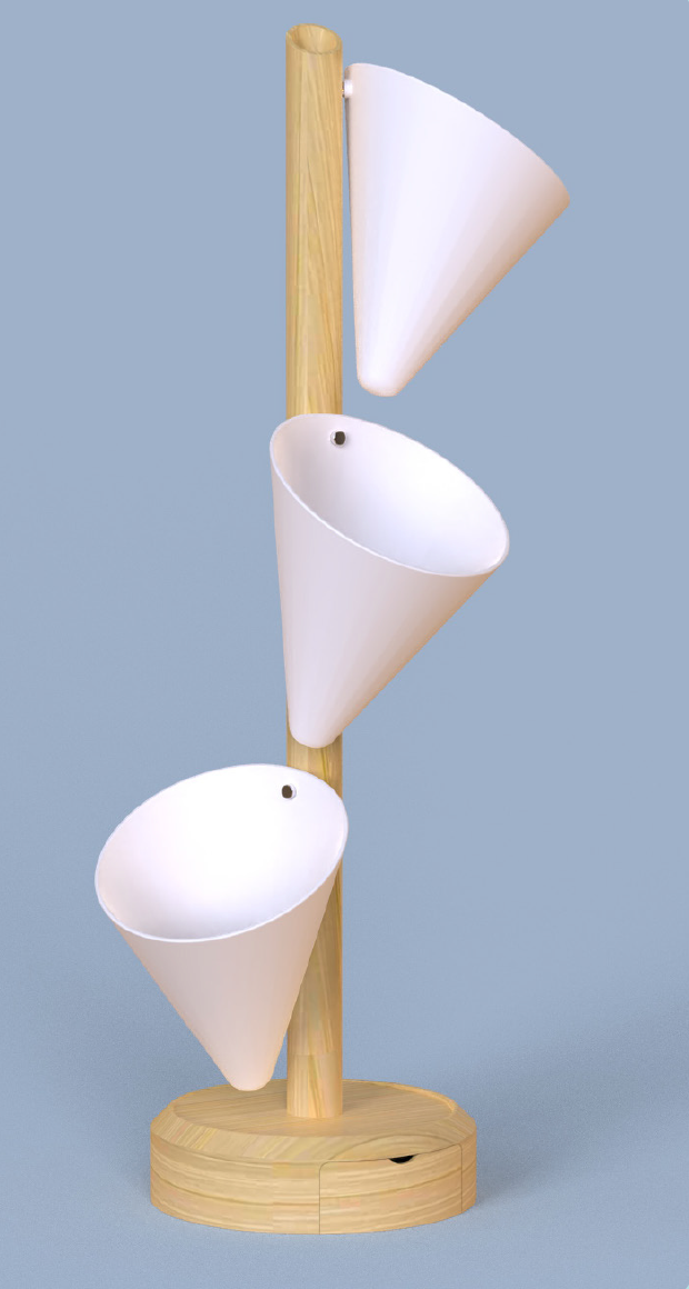
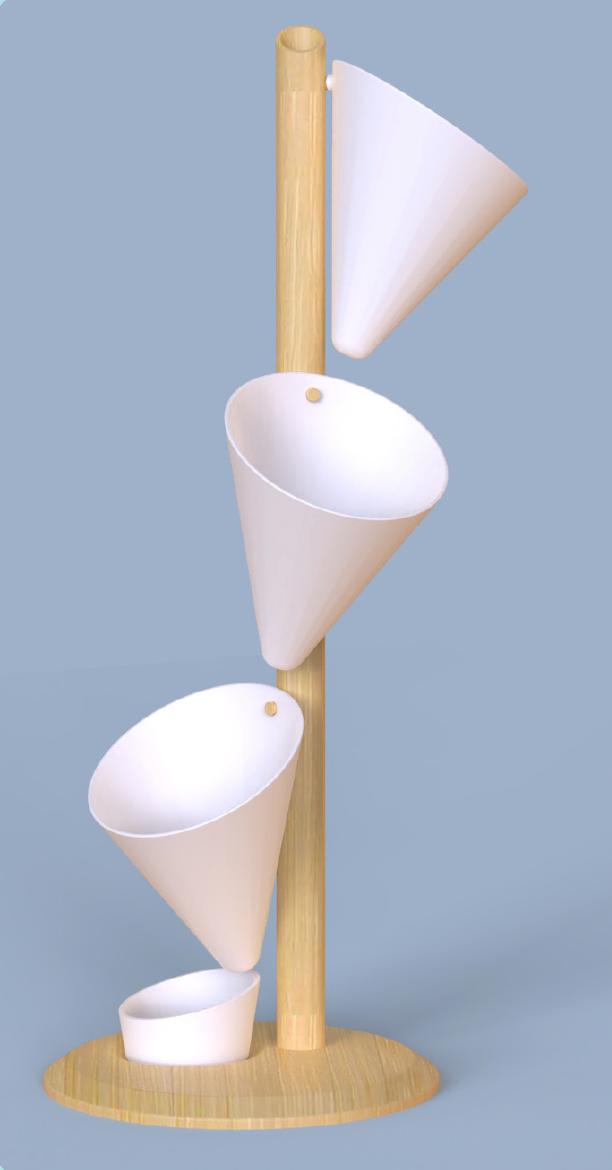
Once the form of our planter was determined, we created multiple 3d renders to help us determine the best approach for the collection of excess water that our product collected. Below are a few examples of the forms we explored during this course.


Branding Round Two:
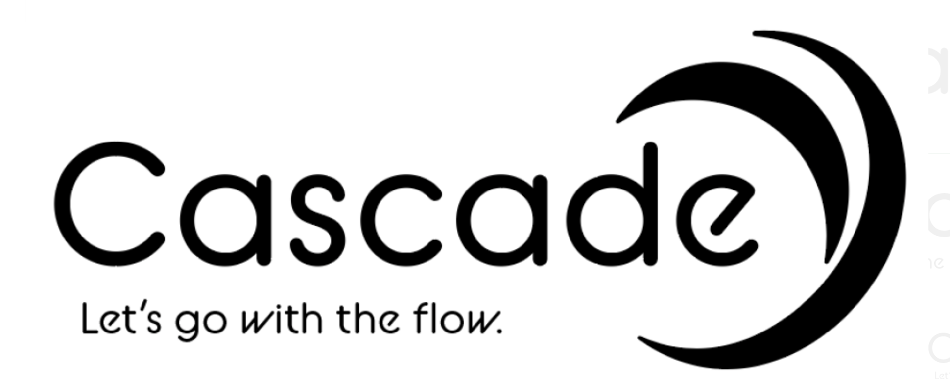
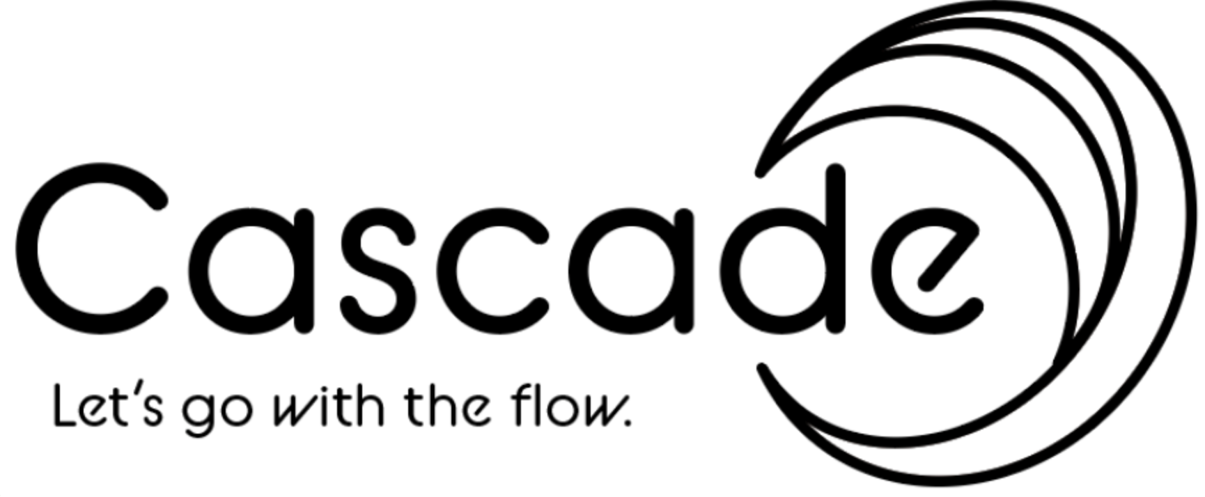
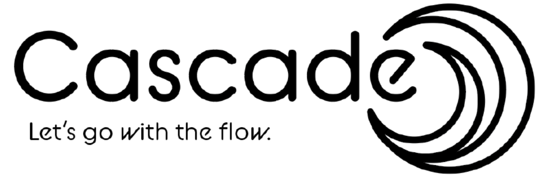
After deciding on our name, "Cascade" and our tagline. "Let's go with the flow." based on the popularity of the name and tagline people voted on. I applied the top three designs to the new name and tagline and created multiple iterations.


Branding Color Study:
From there, we determined three different color studies based on our top three logos. These color studies and logos were tested in our target demographic to determine the direction our logo would take.


Branding The Logo:
In the end the color palette selected was one primary of pale light green, light blue, and a light stone gray. We selected one of the more fluid and open designs to embrace the fluid and free flowing nature of our project.
Product Building and Molding:
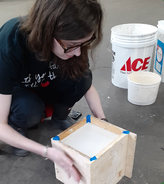
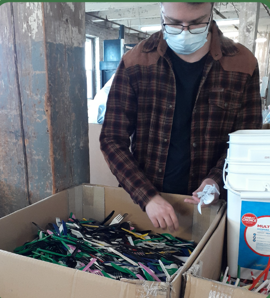
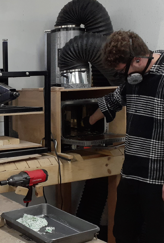
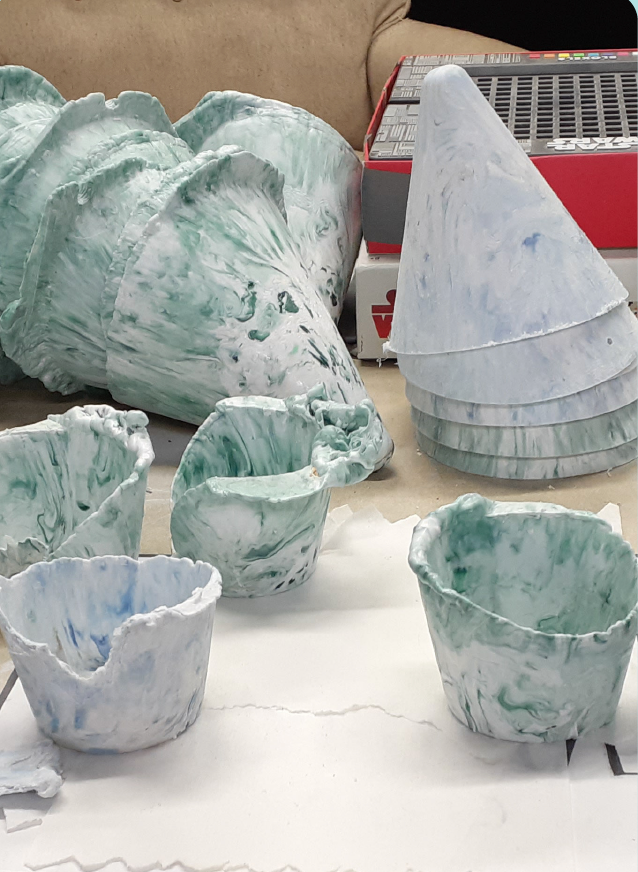
Though the logo and brand was complete, we still had to create and manufacture our product. We partnered with a local group called Precious Plastics to create our molds for the cups that would hold the plants. We did this by molding melted recycled plastics into the shapes and forms we needed. We created the mold and collected and sorted plastic, before molding it into cones.



Assembly:
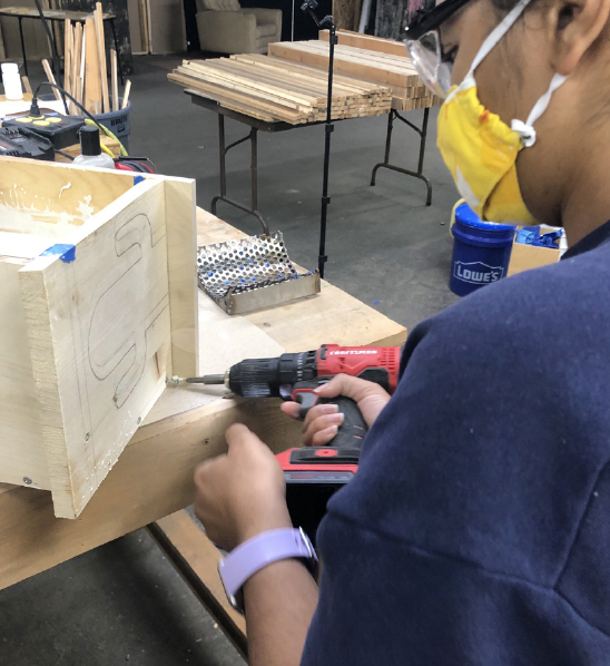
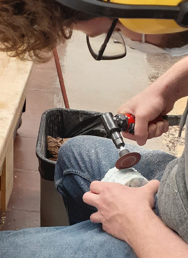
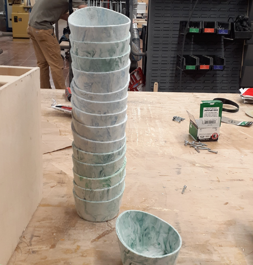
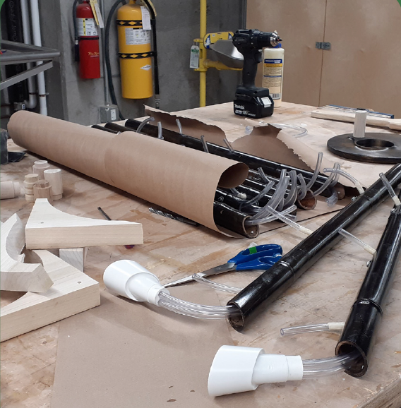
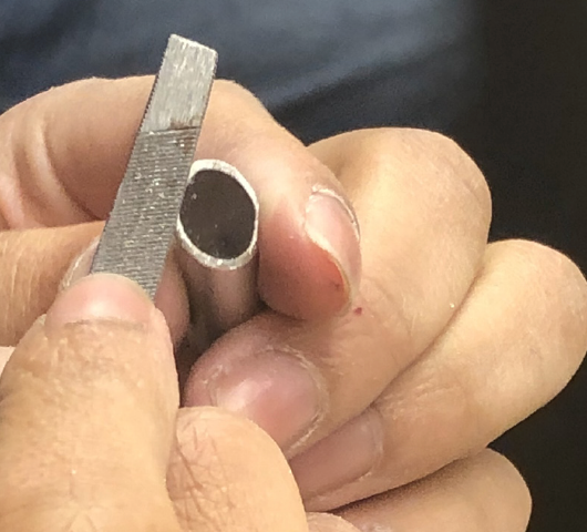
Once the cups were all molded, from there we took our materials and assembled them. This included adding tubes to the stand, sanding, staining the wood, etc.

The Packaging:
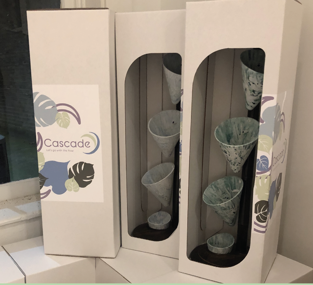
The packaging we decided on was minimal. we selected a simple white box with a cut-out showing off the project with the same type of flow and curves as in our logo. Branching out from the space is a variety of leaves un our colors that frame our logo and tagline. The box is also sealed with a mini-version of our logo as well.

The Final:
In the end, we created a vibrant and fun product that sold out in our small sale. The picture to the left shows my teammates and I at the end of the process, celebrating our experience together.

