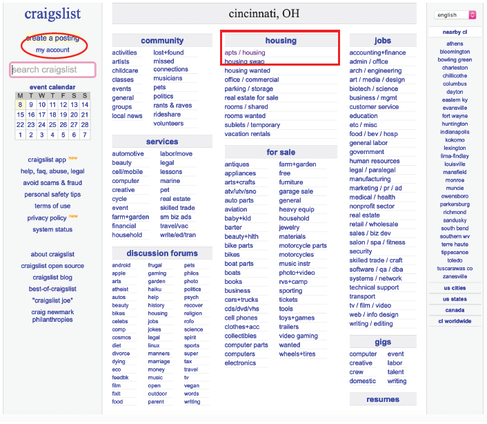
First Thoughts:
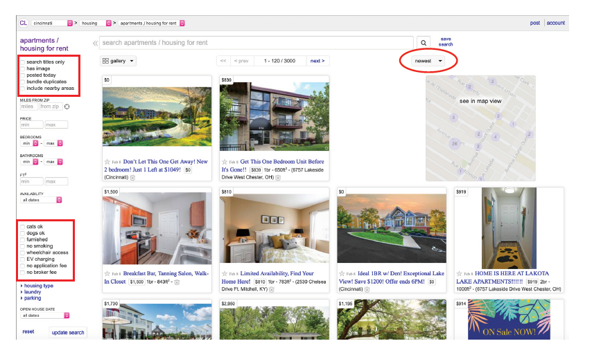
We started the process with basic user-testing. From these tests, I discovered how I wanted to approach my redesign, and what changes I was going to make. Overall, my users had a difficult time navigating the website and determining where to go once given a task. The cluttered feel of the website also hurt the flow and connectivity of the site. The red areas depict the main points of issues my users had problems with.
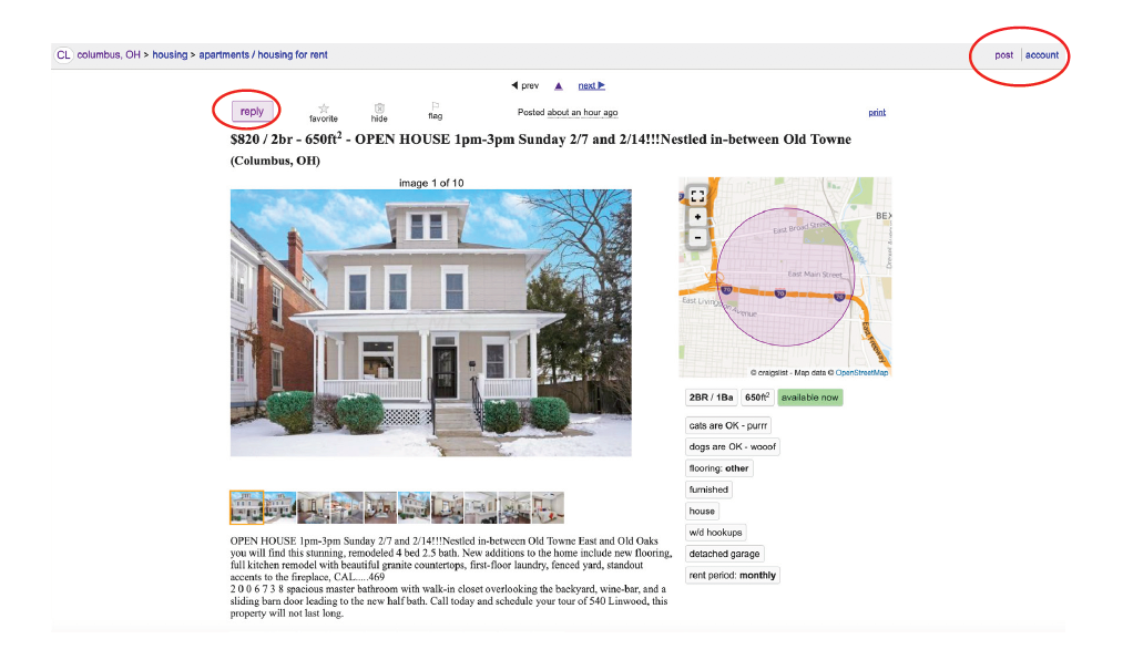

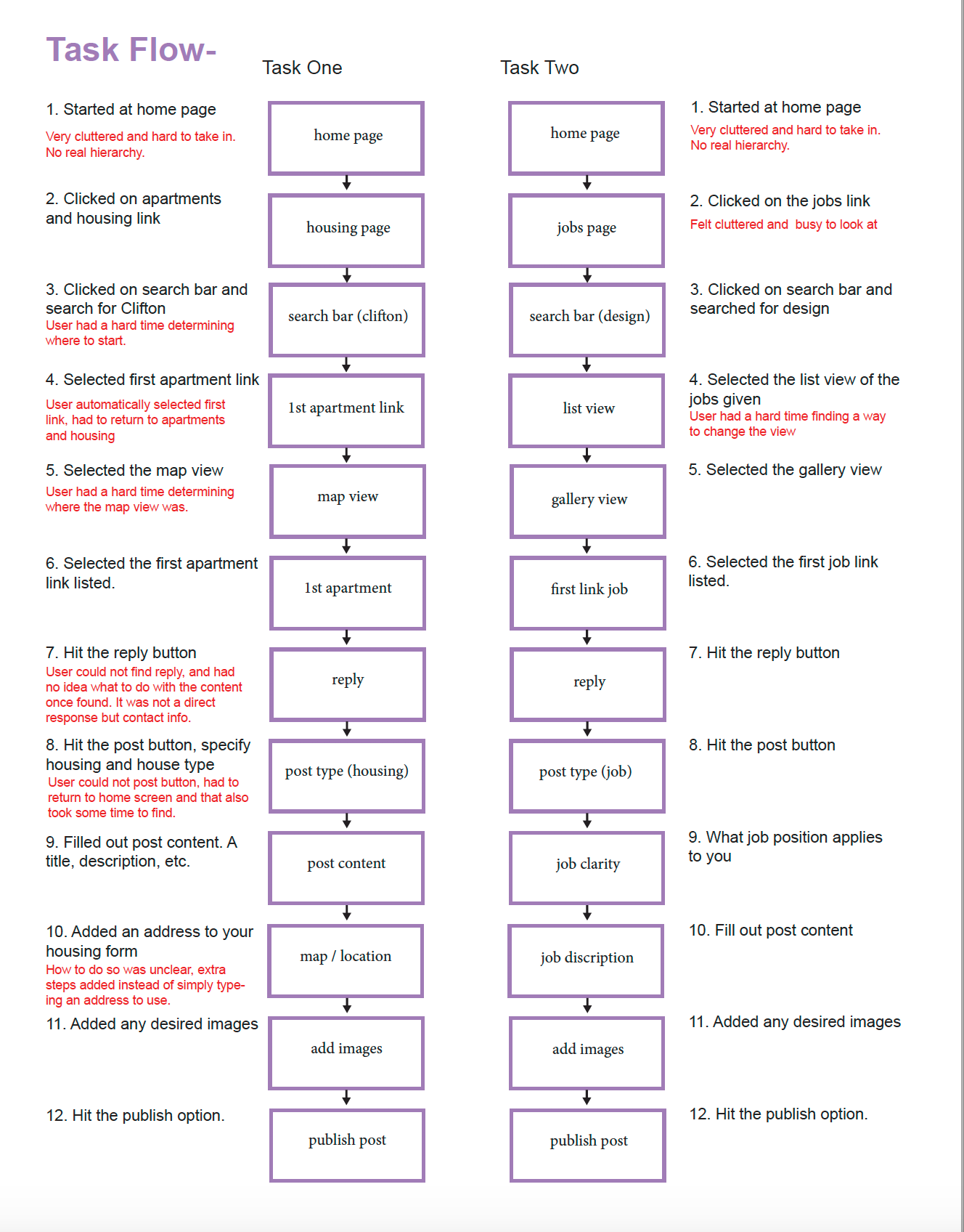
Task Flow:
From there I had to determine the basic flow of the website and identify the issues each section had based on my feedback.
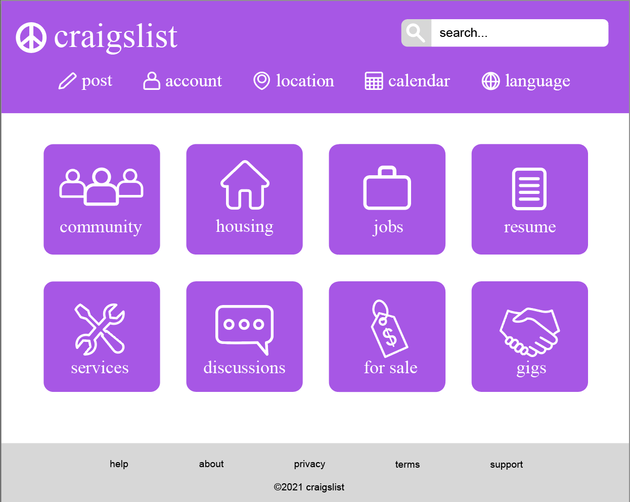
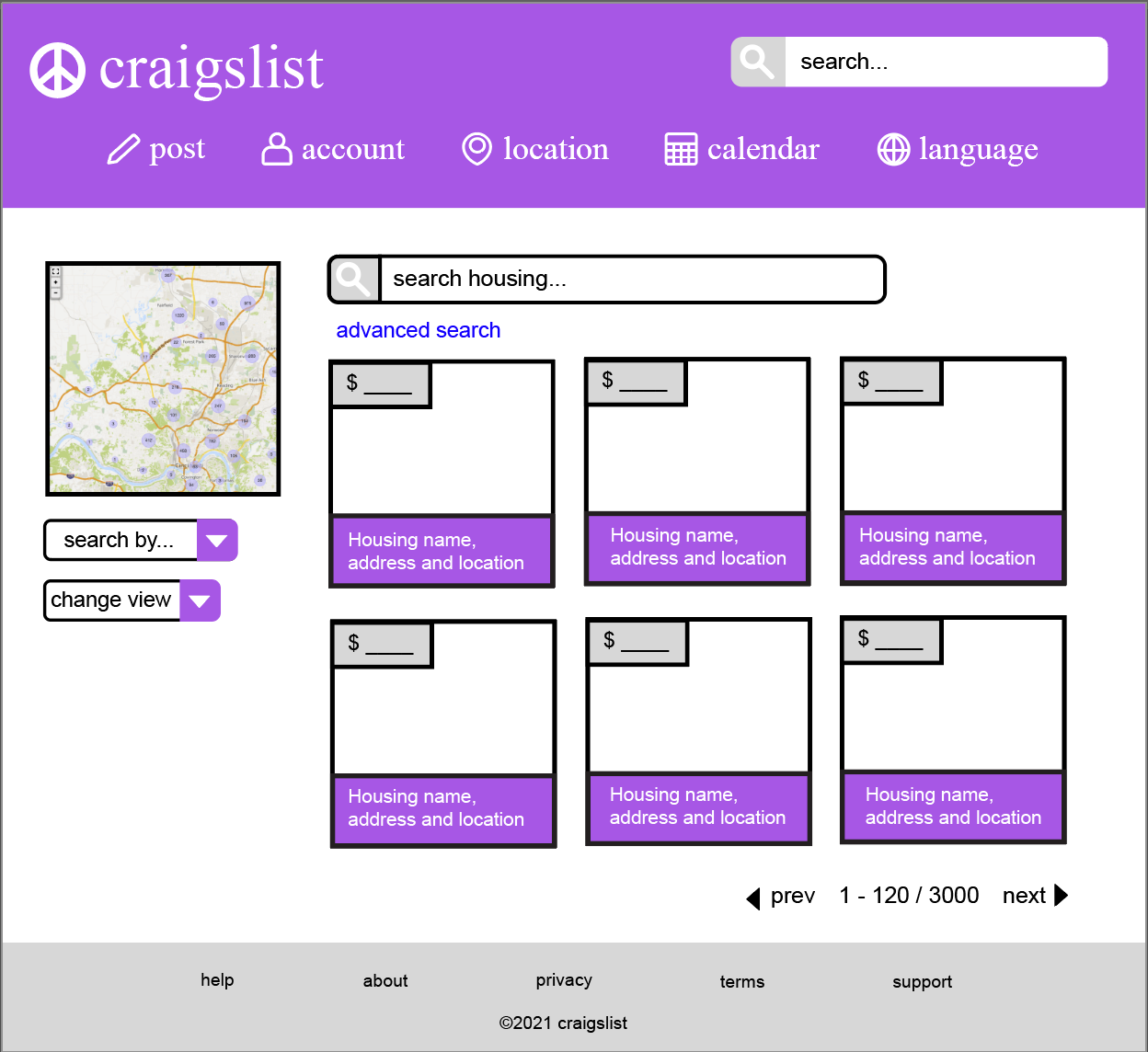
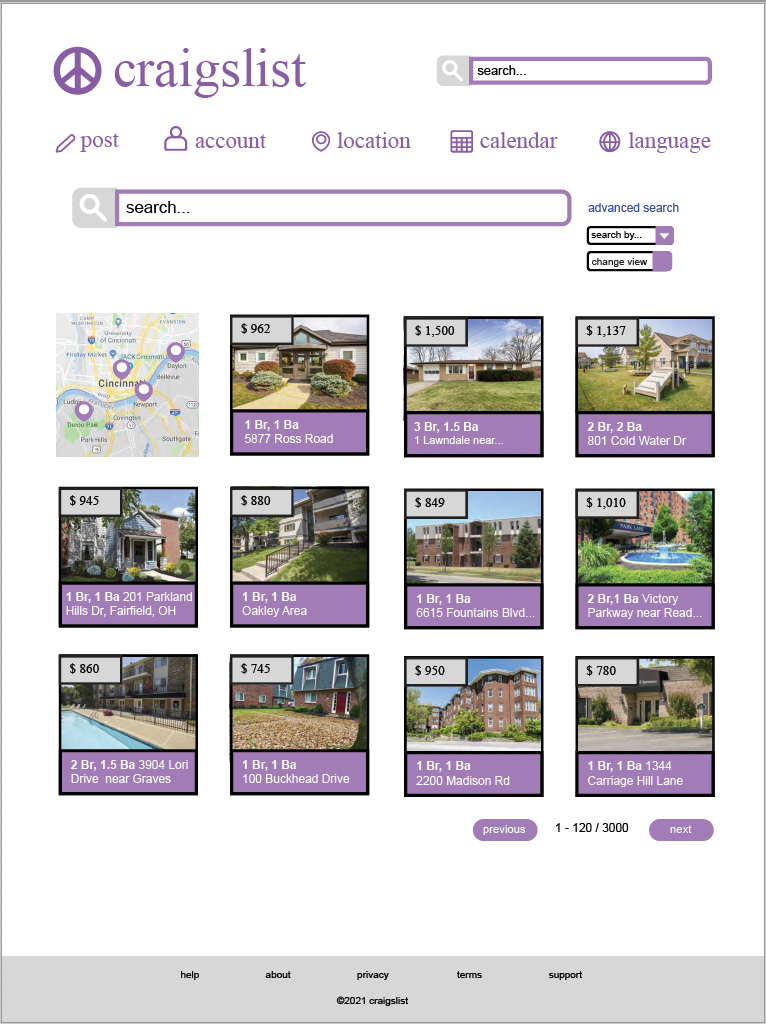
First Redesign:
Below shows my original digital redesign. Originally I sketched it out on paper, but on further review I discovered some glaring issues. The main issues I had with this redesign was the incorrect sizing and spacing of the website, the condensed feel of my design, the incorrect scaling of my website, and the over vibrant purple that felt overwhelming to the viewer.
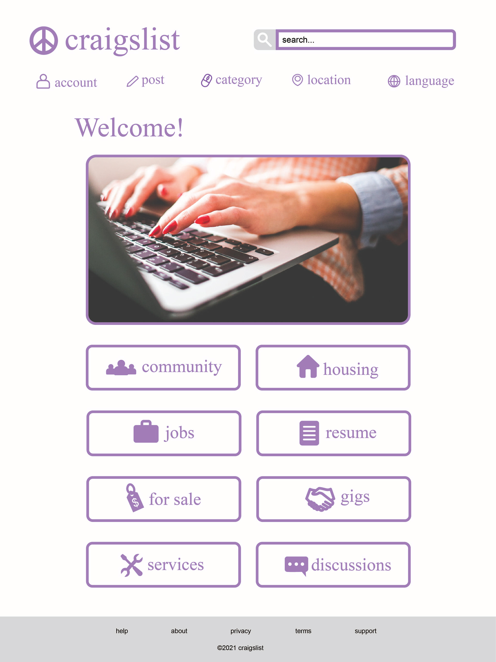
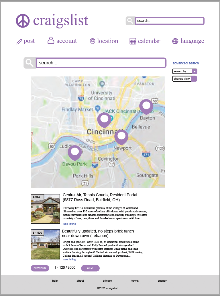
Second Redesign:
My second attempt at a redesign was much more open, friendly, and to scale. I still had some issues with spacing, but the application of the modules for creating a post moved in a much more fluid way. The modules themselves felt a bit more cramped, and the darker lines outlining things allowed a more cluttered feel to happen to the designs.
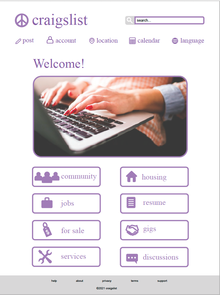
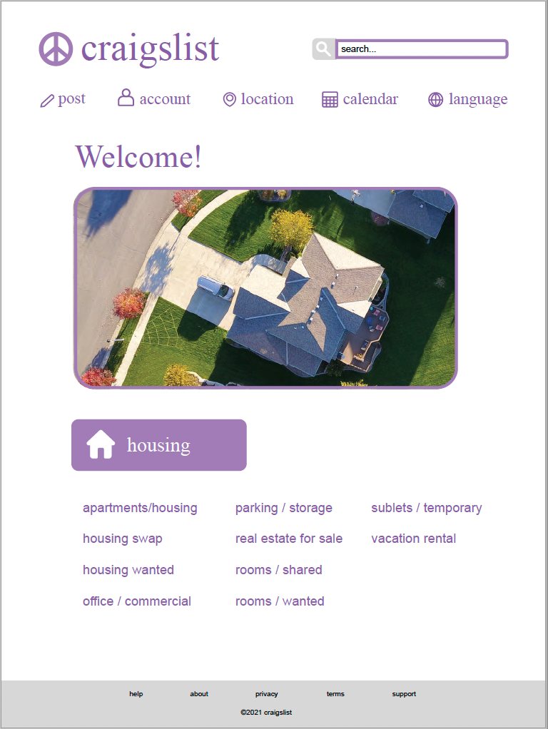
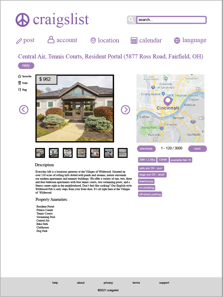

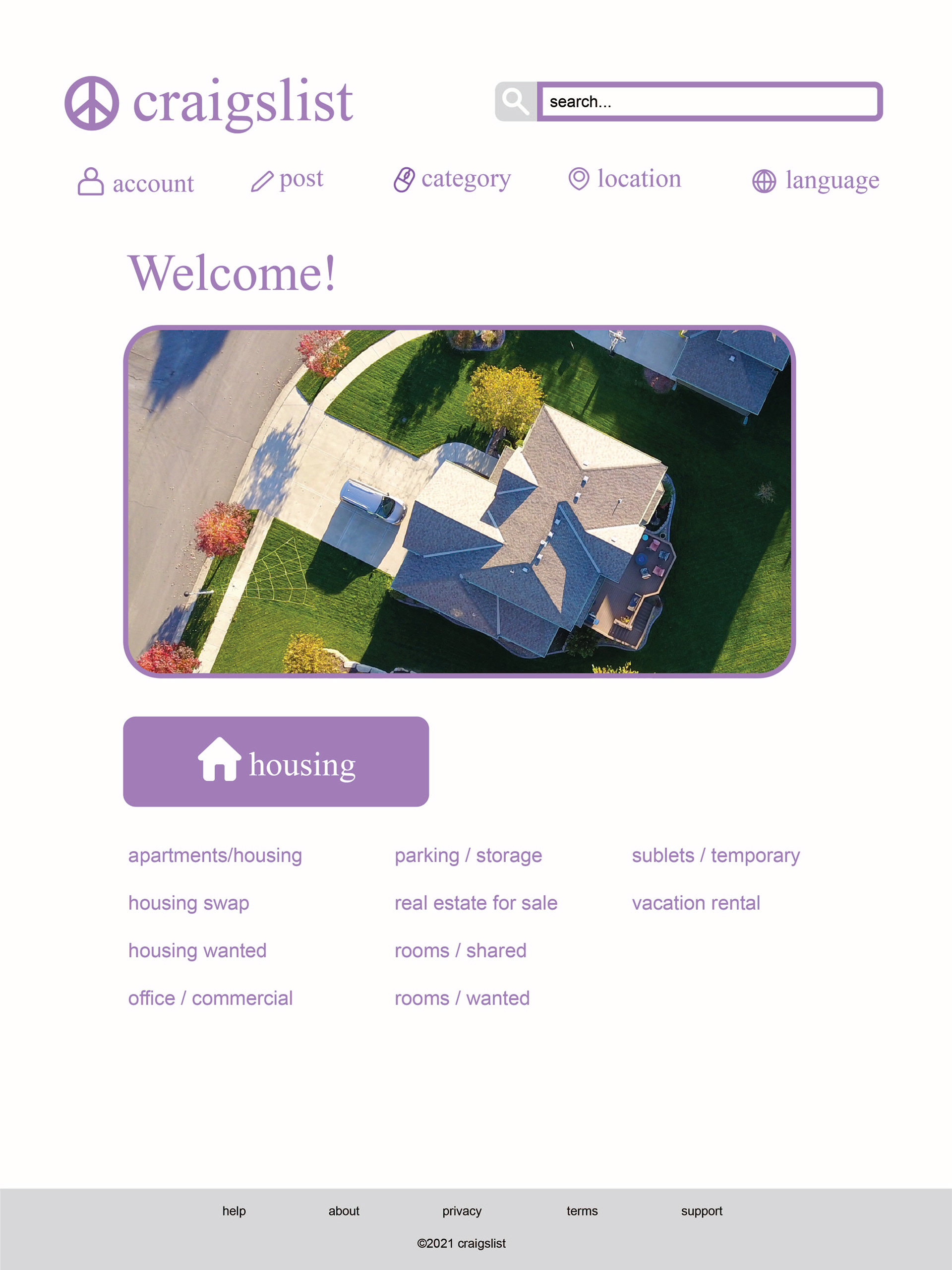
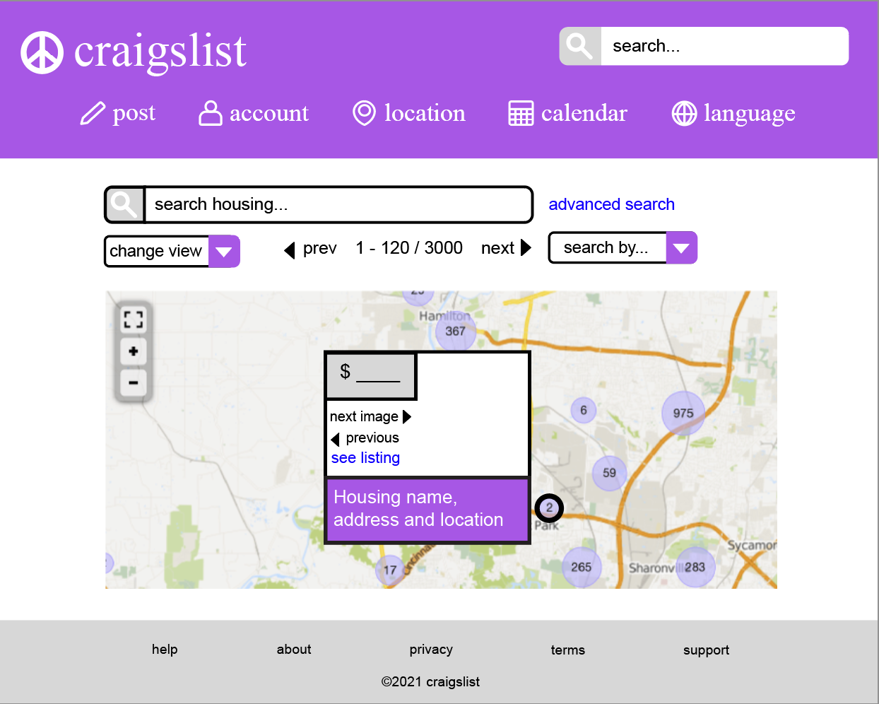
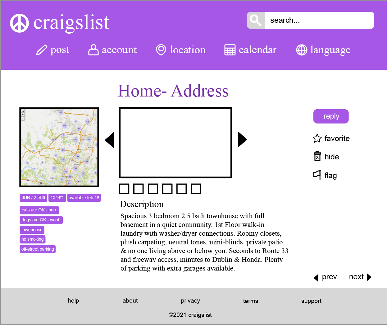
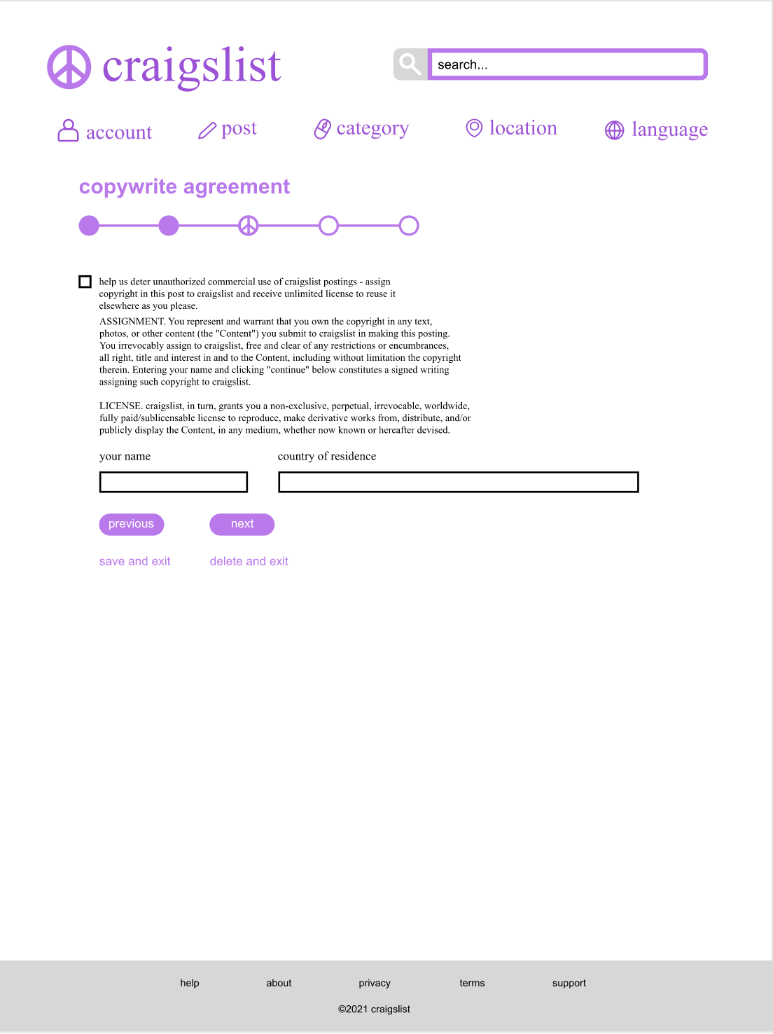
Third Redesign:
My third iteration resulted in cleaning up the spacing, and clearing away the darker lines. However I still had some unneeded screens are the overall type hierarchy lacked in some areas.
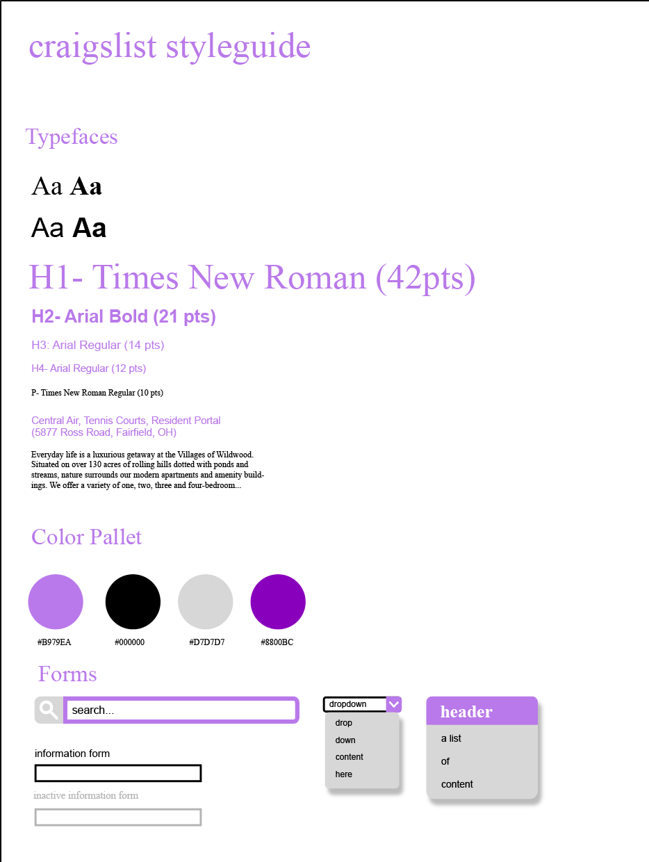
Style Guide:
Depicted below is my final Styleguide for my redesign.

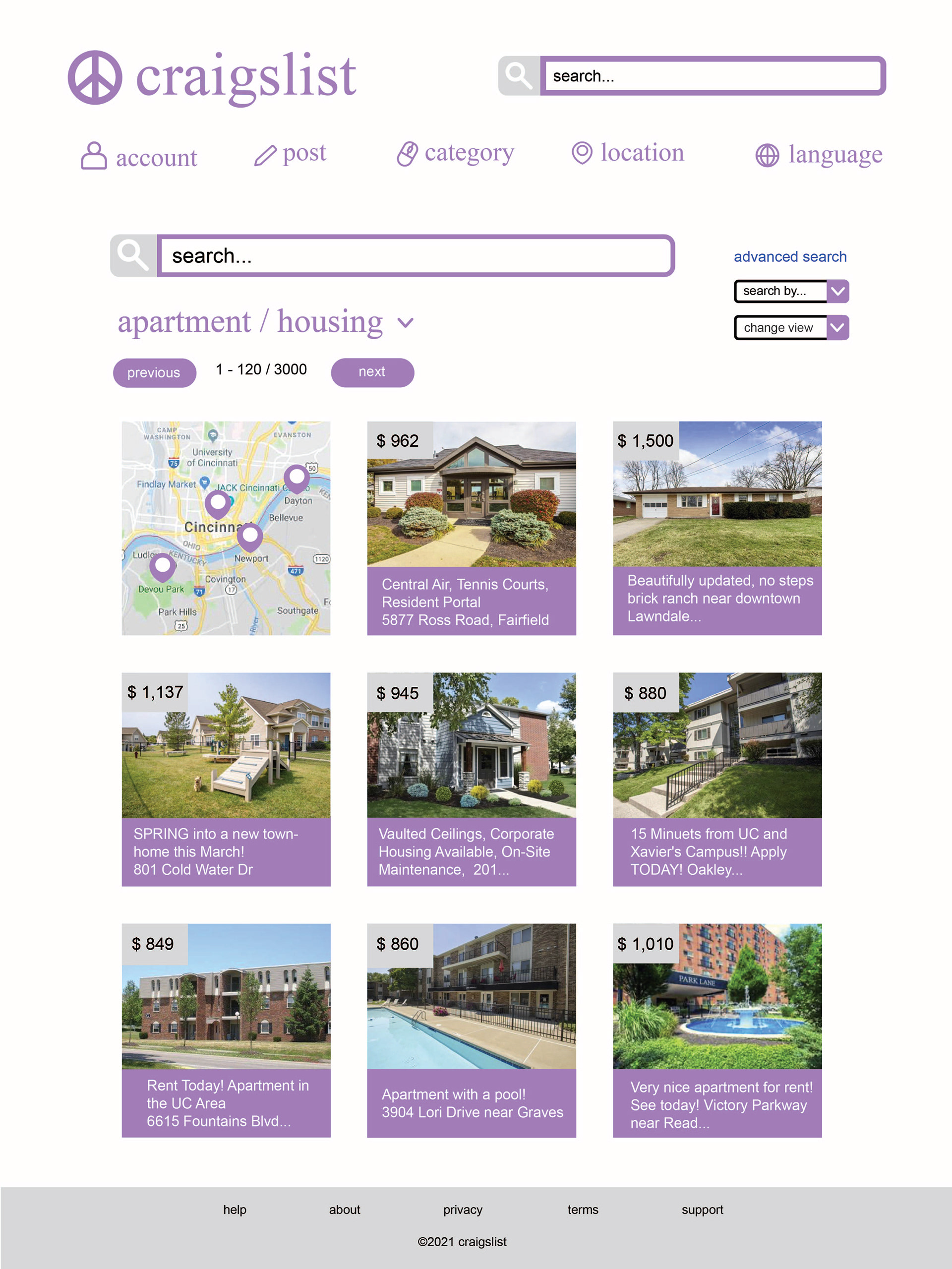
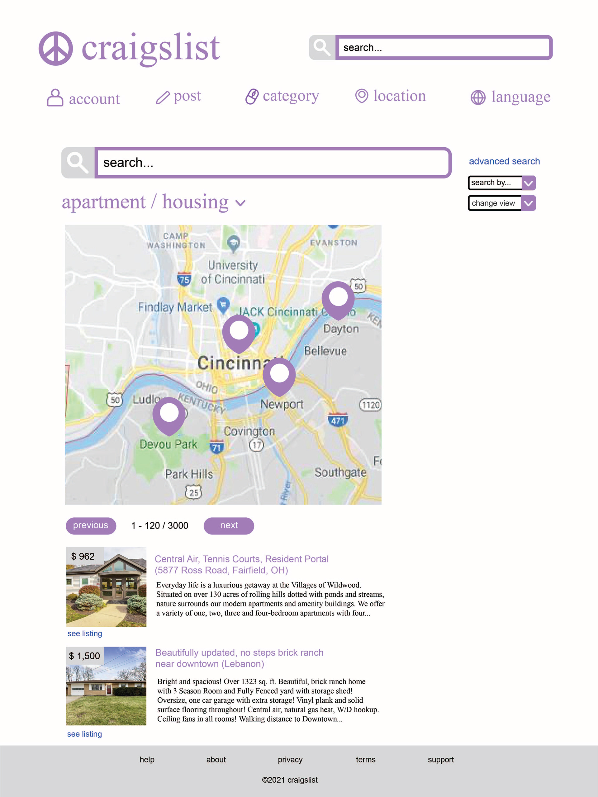
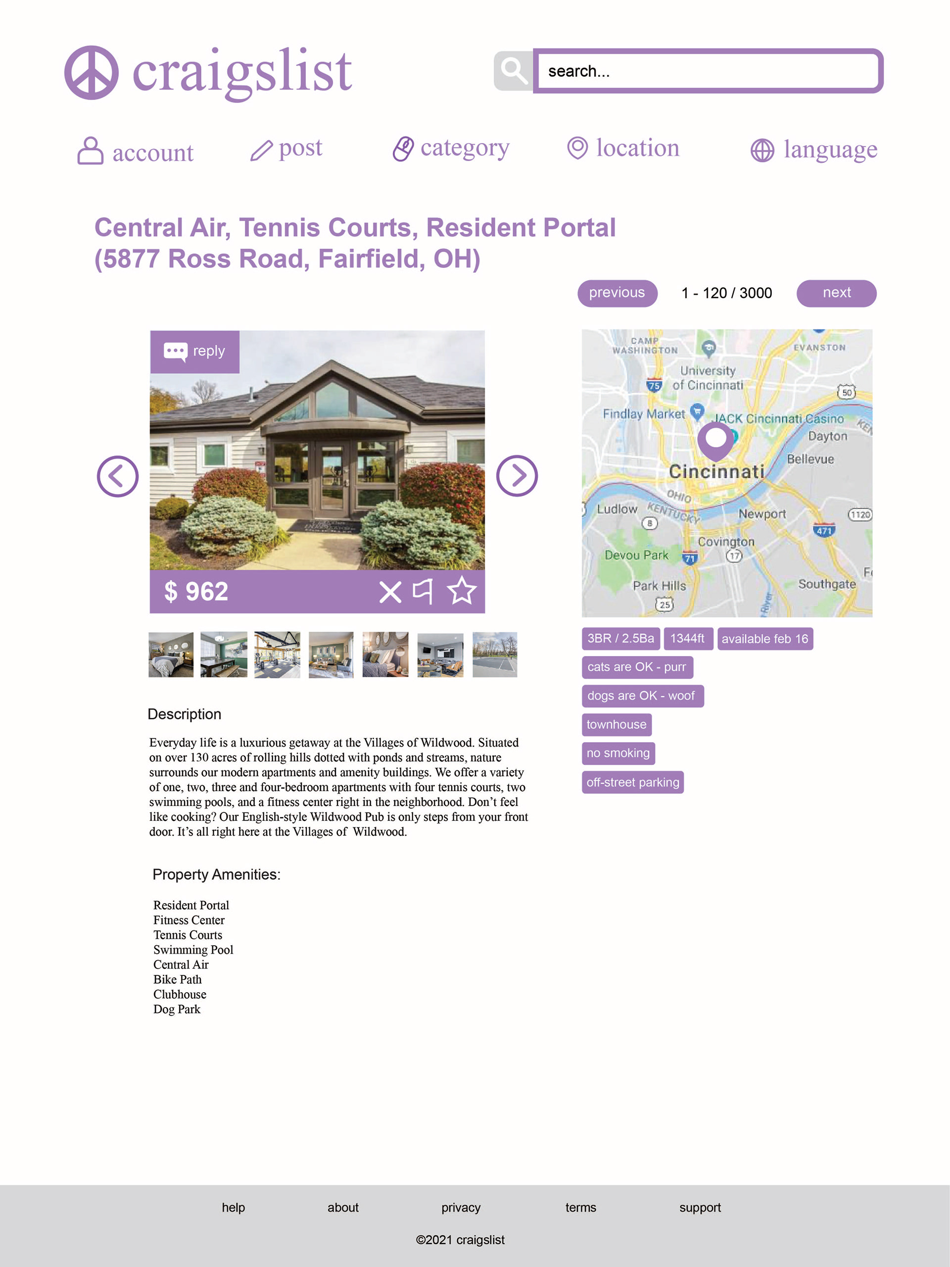
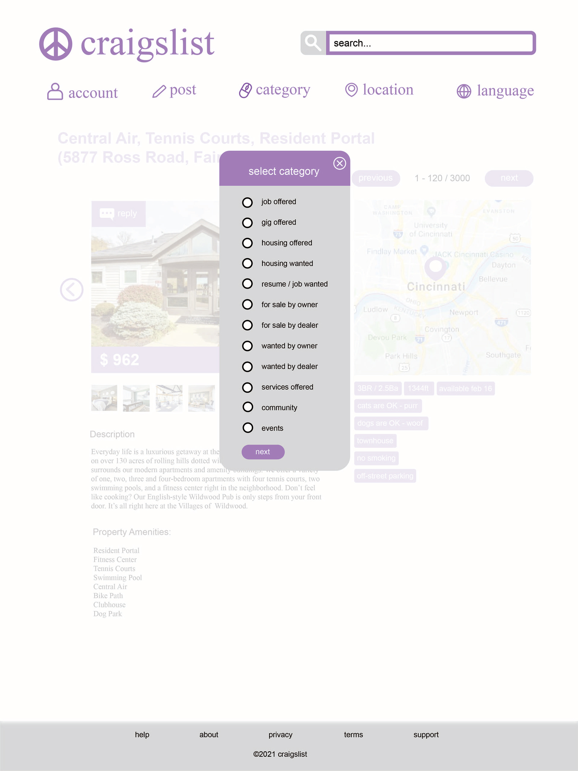
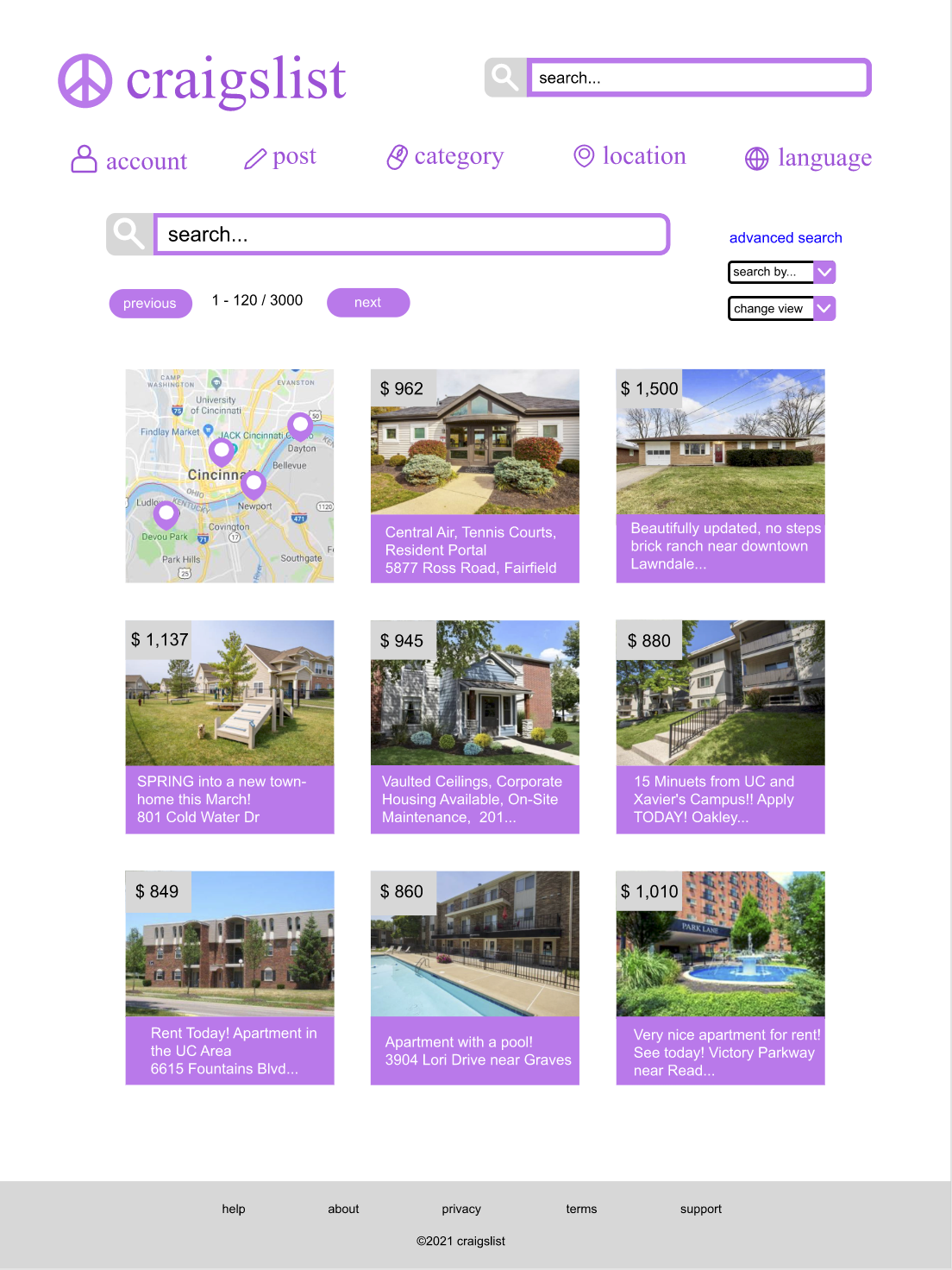
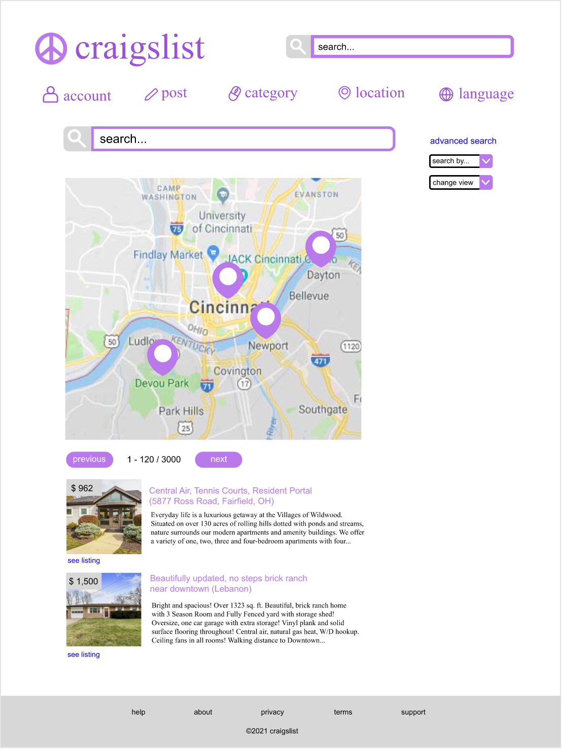
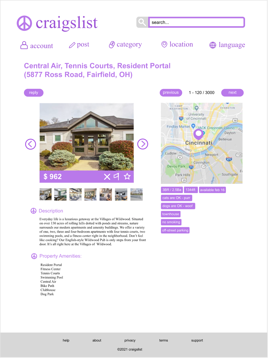
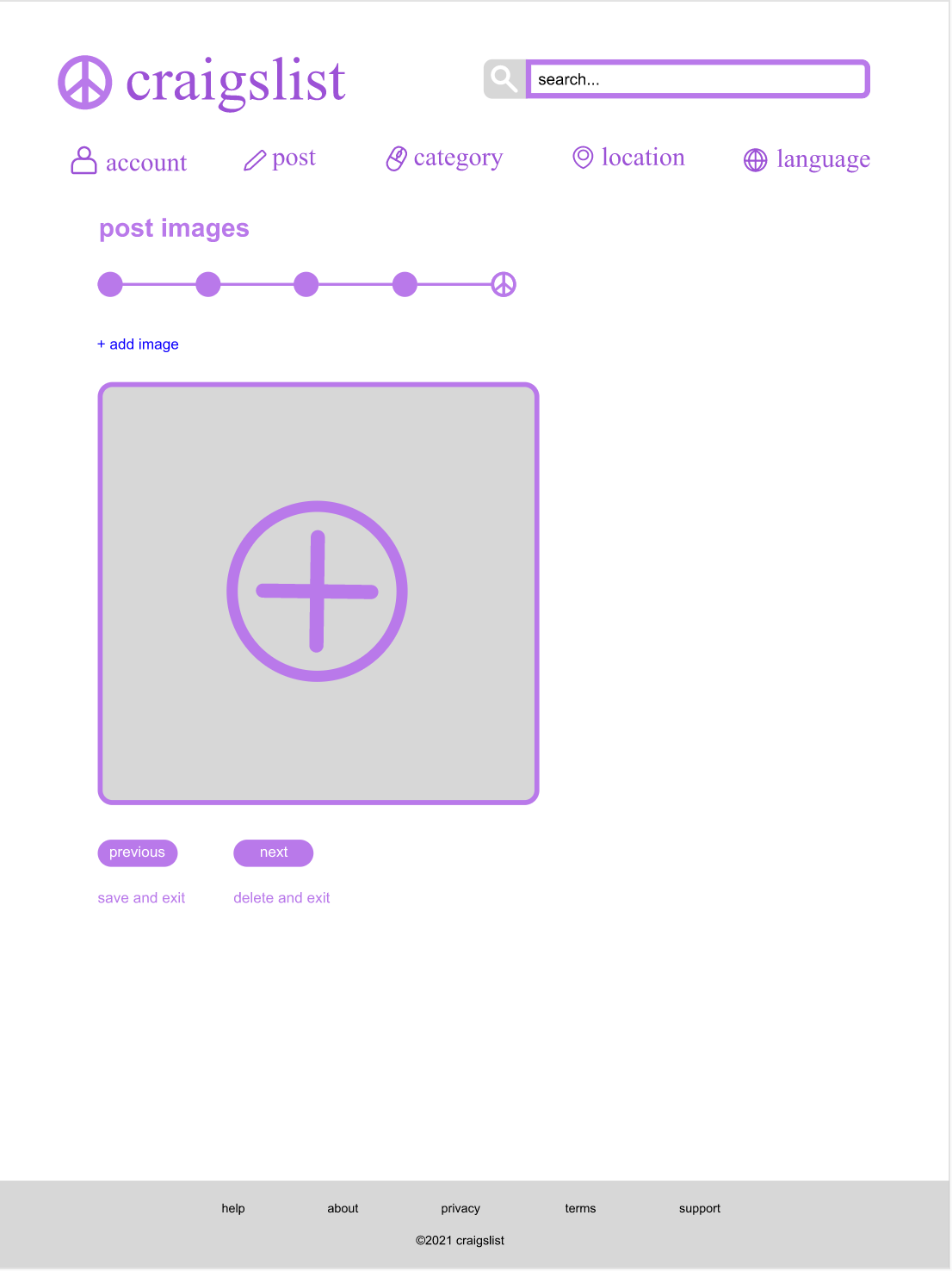
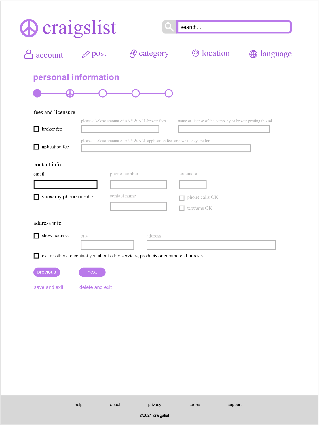
Final Design:
Below is a few pages from my final redesign of Craigslist. To visit the full prototype, click the button below!